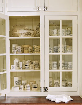


That restricted sort of palette is conscious. The initial impression is that it's plain, but it's a house that slowly reveals itself to you — so it stays interesting when you live there. There are a lot of subtle variations in textures and colors — mostly blues, whites, beiges — and lots of different patterns in the fabrics, the rugs, the spongeware. That's what saves it from blandness and makes it come to life. Often when people decorate with the blue-and-white look it fails, because it's just blue and white. It's like dressing all in black. It works if there's black patent with black silk with black wool...the subtle variations that I mentioned

The main thing was that they wanted comfortable, easy, usable rooms. Nothing formal. In the living room, we have elegant wood paneling, but an eclectic mix of furnishings — all slightly mismatched — to take away any stuffiness.
 You'll see that the master bedroom has a touch of formality to it. We were after a crisper, dressier effect there. It's a little fancier than anything downstairs because it's more private, so things could be more fragile.
All photos Traditional Home
The clients wanted the look of an old-fashioned country kitchen, so we used old-style lights, bead-board on the ceiling, elaborate crown molding. I've done this kind of kitchen 50 times, and one day I asked myself, 'What is it that makes it work?' And I think it's about the underlying quality — the nickel faucets, the Carrara marble, and so forth. Each thing is so carefully considered. And it's also about the simplicity. It's very controlled, not tchotchked-up.
Thanks James Radin -what a lovely home! I love this space! From the painted floors to the antique barber shop pole. Don't underestimate the use of interior windows, they add the illusion of space and light. This window is wonderful.
The kitchen is has such charm. I love the antique hanging cabinets and butcher block center island. Notice the antique towel bar on the end of the island.
This is a lovely dining room. Notice the detailing on the chairs with coordinating upholstered checked backs. The lamps on the side board and beautiful chandelier complete the look!
Finally, the living room - what interesting detail on the walls. This is an inexpensive way to cover not so perfect walls and add unique detailing at the same time. If you are ever in Portland, Maine head to her store SIMPLY HOME -a great collection and worth the trip.