Saturday, January 31, 2009

Belgian Decor at Cote de Texas

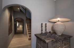
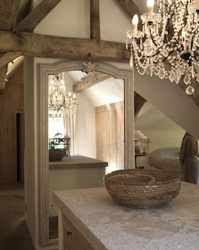
If you have not visited Joni Webb's fabulous blog, Cote de Texas, this is the week to stop by! Joni is an extremely talented designer in Texas. Her blog was recently selected as one of the top ten decorating blogs of 2008-9 by the Washington Post. This week Joni reviews the Belgian Style that is so hot right now across the country.

Joni describes Belgian decor as "quiet and monotone .. plain linens .. antique elements – ancient stone floors, beams, marble staircases, and acres of limed wood - everywhere. Textures are a very large part of this style – rough, rustic woods and stone surfaces are played against smooth, shiny crystals and glass."

In our increasing complicated world this is a style to come home, relax and unwind in - serene and almost austere.

Please stop by Cote de Texas and see the entire post.

I have saved it as one of my all time favorites, so do not miss it! Here is the link: http://cotedetexas.blogspot.com/2009/01/belgian-design.html

Monday, January 26, 2009

Shabby Chic Closing?!

I entered the Shabby Chic store in Natick , Massachusetts today - and it was practically empty. Everything in the store was 50% percent off !

Shabby Chic Website
As you can guess most items were already gone. The women working said it was not confirmed but they may have to close their doors. They were not allowed to take orders and were advising customers that if they wanted to order something they should do it online.

Shabby Chic Website
They would not confirm, but suggested that some of the other stores across the country may be closing in the future. We hope not, as Shabby Chic is such an inspiration!  
Another bad sign of the state of our economy.

Shabby Chic Website
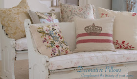
I did happen to pick up some really wonderful pillows, though!

Friday, January 23, 2009

Rich Dunbrack -The Thieving Magpie

Many of you have emailed me for information about the whimsical clock I have in my kitchen. I thought it timely to share with you the work of Concord, Massachusetts Folk Artist, Rich Dunbrack.

I came upon his work quite unexpectedly at a Sunday morning flea market in Rowley, MA almost ten years ago. There he had stored in a barn, several pieces which were not for sale, but waiting to ship to lucky, new owners. I was immediately smitten with his work. Rich uses found objects and architectural antiques to create his one of kind pieces. Cupboards and clocks can contain fragments of old buildings, antique iron grates, bedposts, clock faces, old farm tools, eel spears, wooden paper mache molds and old barn siding. He meticulously blends these elements together and creates what he calls art that is "utilitarian with elements of vitality." You can"t help but smile when you see his work in person.


Here are a few of his pieces:

Happy Moon Cupboard

Includes building salvage from western Massachusetts, house and tobacco farm materials and an antique moon paper mache mold.

Head and Shoulders Above - Tall Clock

Fabricated from southern Vermont salvage, Victorian house fragments, a bronze doll's head and a period clock dial
Old Road to Nine Acre Corner - Column Cupboard

Built with period New Hampshire artifacts including a Federal house column, Victorian house fragments and iron fittings and hardware, Victrola tube and a mahogany, folk art carved figure.
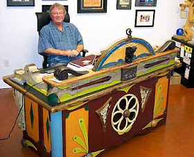
This custom desk built for the owner of The Zoo Factory in Florida is only one of a few desks Dunbrack has ever fabricated. Another sits happily in Carly Simon's house in Martha's Vineyard. Simon was an early collector and supporter of Dunbrack's art.
Spying Moon - Cupboard / Pantry

Fabricated from Southern NH reclaim, 1800's Federal house materials, period folk art carving and cast stove fragments The 5 Hole - Cupboard

Fabricated from southern Vermont salvage, Brattleboro, VT Arts & Crafts period home, folk art carving, and an early eel spear.

If you continue to be intrigued, check out Rich's website at http://www.thethievingmagpie.com/.
I am sure it will bring a smile to your face!
Thursday, January 22, 2009

My Kitchen Unveiled!

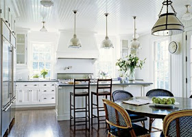
When I bought my house I felt the kitchen needed some minor renovation. Here's what I liked: the layout and the windows across the entire back of the space,which gave it incredible light. I liked the white cabinets, and the recessed ceiling in the kitchen area. What I didn't like was the lack of a center island and the way the cabinets seemed cut the space in half. I disliked the backsplash, and the very badly scratched white Corian counters. I also disliked the lack of mouldings and details, that were so abundant in the other rooms of the house. These pictures were taken when the house was for sale and include the previous owners furniture and accessories.


The area above is also the family room space, though they had taken out the couch and love seat. I felt like the table was too close to the family room. An area needed to be added for the table to have its own space. During this renovation we designed and created a glass breakfast room for the table.

Here are some inspiration photos:

This is a Victoria Hagen kitchen. I loved the soapstone, subway tile and pendant lights. I also liked the beadboard ceiling, but perhaps a bit more scaled back.


These two kitchens are from the Swedish Company, Kvanum Kok. I love the hardwood floors, soapstone counters and glass cabinets. I especially fell in love with the X cabinets.

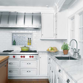
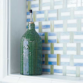
I loved this box out behind the stove for oils, peppermill, etc. I liked the different tiles with the white subway tile. But I preferred Calcutta marble in a herringbone pattern like this one below:


Here's my inspiration:Here is my box out behind my stove:


Here is the full view. I also added a marble shelf. It is a small feature but it adds so much!

Here is the before looking into the kitchen: (that is me holding my nephew while my sister takes the photos)
Here is the after:

We pulled out the small upper cabinets above the island and added pendant lights. We replaced the upper cabinets by the stove. Then we also pulled out four of the lower cabinets to create a center island. The new "island" has curved soapstone, which you can not see in this picture. Notice the beadboard in the recess of the ceiling and the pendant lights. Also look at the before picture and notice how the windows are lower than the doorways - this always annoyed me, but I was able to correct it during the process.Notice the plain ceilings in the before picture and the beadboard ceilings in the after. Also new sinks and faucets and moulding details. I also added ice box latches and bin pulls to the cabinets.Here is a great picture of the windows which have been raised up about 4 inches so the door and window moldings align.

Here is the TV area before: And after:
New gas fireplace and mantle. Notice the detail work; the moldings wrap the entire room and match the living room moldings which are original to the house.
Here is another view which peeks into the living room and dining room. (The clock is an art piece by a local artist who uses salvage materials to create new objects) Finally the kitchen looking toward the Butler's pantry. I think the gray walls of the kitchen with a touch of marble and beadboard ceiling, ties in nicely with the gray cabinets, marble and beadboard in the pantry.

As soon as my new furniture and chandelier arrive I will show you the lovely glass breakfast room with beadboard ceiling and adjacent family room area!
A little inspiration, finding the right quality cabinetmakers and lots of time helped bring my kitchen up to date and back to the original quality of the rest of the house. We are very happy with the result.

Sunday, January 11, 2009

My New Butler's Pantry - Before and After!

When I moved into my 1930's Royal Barry Wills Colonial four years ago I was certain the room the real estate listing indicated as "small office off kitchen" would someday turn back into the Butler's Pantry it was originally intended to be. The room measures 9' X 8', and because of the way the lot is graded it has 9 foot ceilings and a lovely, large window. Over the years the previous owners removed the original cabinetry and moldings.
As you can guess, I had grand visions (and a limited budget)!
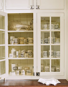
I wanted it to be an office and a real working pantry -storage for platters, serving pieces, my mixer, and a place to roll pastry crust. I wanted to hide away my microwave, have filtered hot and cold water. We needed file cabinets for family organization and a place for the family computer and hard drive. I wanted to be able to sit in this Pantry/Office and blog. I wanted to showcase my mothers heirloom, turn of the century China. And, I insisted that it look original to the house but with an updated feel. Here is an inspiration photo of the glass front cabinets. I also wanted honed marble counters for rolling pastry. Because my kitchen cabinets were white I wanted the pantry to cabinets to be different, but not wood, so I wanted a gray/green color.
Cote de Texas
Here is my inspiration photo for the color of the cabinets. Many of you may recognize this kitchen, it is Sally Wheat's Kitchen from Cote De Texas "Stalking the Wheat's" post. Joni was kind of enough to put me touch with Sally who shared her color with me. Do not miss touring Sally's house. It is incredible - she has wonderful taste and talent! Here the link.
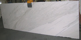
After four months of searching I finally found my marble. Here is my slab of Calcutta before it was installed.
I wanted period style hardware. I loved these from Christopher Peacock. I ended up finding a nearly exact replica from Cliffside Industries. Lucky find! Vertex
As a family, we drink gallons of bottled water. At my husband's urging we found this bottleless water filtration system from Vertex. It heats and cools the water and connects directly to a water line. No more lugging bottles or polluting the landfills and the kids make their own hot cocoa and cup a soup instantly.
I found a wonderful cabinetmaker who was able to work with in my budget constraints. We had some mishaps with other subs, but were able to hide/fix the problems, so hopefully you can't notice them.

Here is the before:
And After: The Butler's Pantry! The cabinets go all the way to ceiling and the molding wraps around the room. Walls are real wood tongue in groove beadboard. You can't see that the counters are honed, nor can you see the bevels on the glass. The color is more gray than green and the counters have much more contrast than these pictures show. The microwave is hidden in the the cabinet in the bottom left of the photo. Drawers have platter and serving pieces. The appliance garage on the left holds my Kitchen Aid mixer & Cuisinart. It's still too new, so I haven't rolled out pie crust yet -but I will in time.

This side is my office area. Cabinets house file drawers and the hard drive. The appliance garage on the right has shelves for bills. The cabinet on the bottom right of the photo has a drawer for each family member - this is a handy place for keeping homework and school things organized. The far right is the bottleless water cooler - we love it!
So if you ever wondered where I am when I am blogging - here it is! I think I accomplished all I had hoped. My husband calls it my little jewel box - and really it is! Hope you like it!

Tuesday, January 6, 2009

Beauty in Portola Valley

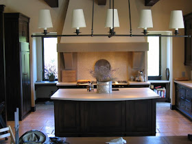
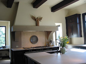
BCV Architects in California do some extraordinary work. Here is a kitchen that is stunning. It has been posted on BCV Architects website. It also has been on the GardenWeb's Finished Kitchens Blog Forum since 2004 and still four years later, there are comments of admiration being posted.

It is a wonderful and peaceful space. The owner refers the kitchen as Tuscan meets California Wine Country. I call it beautiful and timeless!
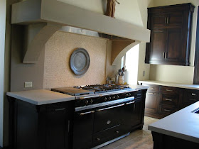
Notice the Beautiful honed caesarstone in Baja on the counters, with a double thickness added on the edges to give the illusion of greater heft. I love the mosaic backsplash.
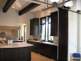
A Lacanche Fontenay range! The Rolls Royce of ranges. Stunning!

Notice the lovely windows. The owner mentioned that the Astec extruded bronze windows were imported from Italy. Also notice the bronze pulls.
The doorways on either side of the range lead to a pantry area. .
The area has a dog watering/feeding center, additional stove and microwave

With every renovation the architect's design is an important component, but also the owner/builder relationship and their ability to execute that design is paramount to success. In this case it seems a very talented and tenacious owner was able to create a space that is elegant, peaceful and timeless. Let me know if you agree.

I encourage you to click on the Garden Web link to read the owners comments in more detail. She is very gracious and forthcoming with her experiences and information.
http://finishedkitchens.blogspot.com/2005/06/bosches-kitchen.html.

Also more pictures of the entire home including the exterior and the dining area are on the BCV website: http://www.bcvarch.com/home.html