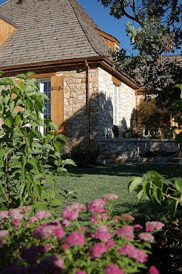
Earlier in the week I promised you a tour of a wonderful newly constructed house in Utah. Built by a reader of WD and her husband (who previously worked for Christopher Peacock Kitchens). The house is an wonderful example of true craftsmanship.
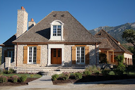
We were able to get a private sneak peak into this home which they refer to as the "French House". The home is currently for sale, and unfurnished.
More often than not designers spend large amounts of time bringing interest and depth to plain rooms. I think it's important to show how wonderful and warm a home can look, even unfurnished, for you to have a true appreciation what good architecture and craftsmanship can bring to a space. Even empty this home is stunning.

The main entry, though not grand in size is really beautiful. Notice the key details here: herringbone floors, hand forged iron railings, exquisite moulding details and a beamed ceiling. Beyond we see an interesting curved hallway.
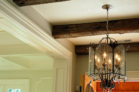
Here is a close up of the reclaimed hand hewn barn beams
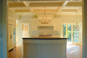
Of course when the builder is also a world class cabinet maker you know the kitchen will be the jewel of the home and this one is gorgeous! It has a very Christopher Peacock feel, but I think this particular kitchen has even more personality. I love the front X detailing on the center island. Also notice the coffered ceiling. I also like the choice of light fixtures!
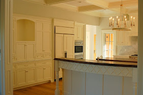
Notice the the first center island has a soft curve to it, which was harder to see in the picture above. Having a conversation at a curved island versus a straight one is much more enjoyable. You should always try to incorporate even a soft curve in a kitchen island if possible.

I love the subtle diamond shaped marble tile backsplash. As expected the kitchen is outfitted with top of the line appliances.

The first island has been thoughtfully designed with a step down so guests can't view a messy sink. The second island is topped walnut for food prep.
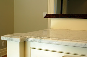
Here is a close up of the corner detailing on the island! Wonderful!
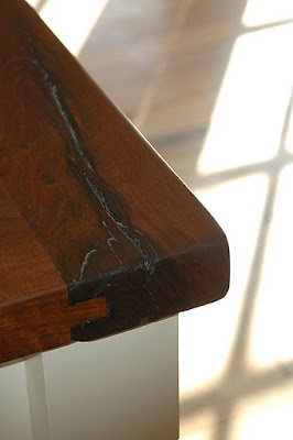
A close up of the walnut top - notice its tongue in groove and bread board sides.

Coffered ceilings continue in the Living room, which also has a stunning fireplace and surround. Can you imagine how wonderful this home would look furnished?

The dining room with French doors and interesting moulding details

The family room continues the coffered ceilings. I love the fireplace! My imagination is going wild furnishing it in my head!
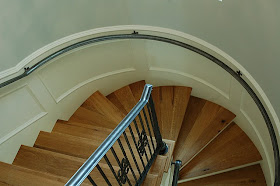
The curved staircase is just stunning - hand forged iron railings are beautiful.

A quick peek into the master bath which reveals a coveted zinc soaking tub.
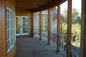
This porch off the Master bedroom is one of several porches to take in the spectacular mountain views.
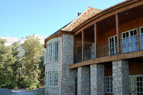
Notice that the outdoor detailing and stonework are as elaborate and thoughtful as the indoor detailing. This shows just part of the back of the home. See the mountains on the right.
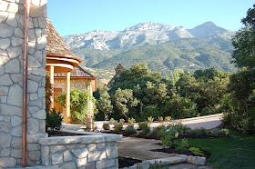
Here is a side view - a lovely landscaped path - notice the copper gutters and cedar shake roof. More spectacular mountain views.

I adore the charm of these shutters!
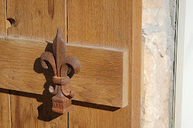
No detail was left out. Look at the close up of these iron fleur de lys.
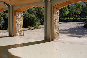
Even the garage was not overlooked. I love the heft and depth of the stone outside the garage. Look closely to see the herringbone brick detail in the driveway.
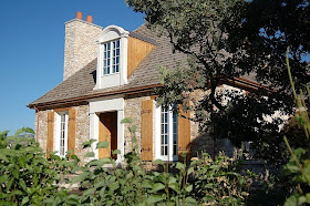
This gorgeous house is a spectacular example of craftsmanship. It was recently on the local "Parade of Homes". For more information on this home and to see
the real estate listing click
here.
For more information on the iron work and railings click
here.

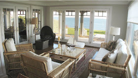

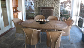 Finally the wonderful outdoor screened porch. It really is a room of its own with the


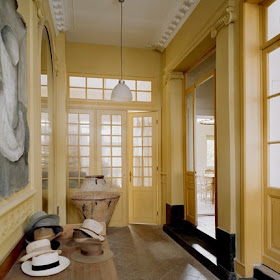 The large entry is painted a beautiful buttery cream while the ceilings and upper mouldings are painted a contrasting white. The doors and built in mirrors add to the already light filled space. An antique woodworker's table is a beautiful place to display the owners collection of vintage hats. The light fixture is from IKEA.
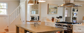
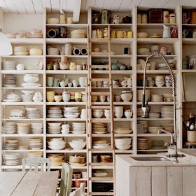 The kitchen is so wonderfully rustic. Old library shelving is painted white and used to display the huge collection of dishes and serving pieces. An antique library ladder is used to retrieve those items too high to reach. Notice the thickness of the shelves; thicker shelves were created to handle the weight of the different types of crockery. I love the interesting contrast of the industrial style faucet.
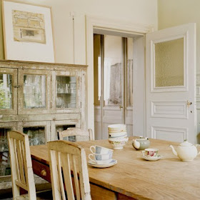
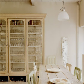 The owners extensive glass collection is housed in an antique museum case that was painted a soft white to match the walls and highlight the glass. A collection of old unmatched chairs were also painted in soft pastels which unify them. The soft colors and leaning antique mirror add to airiness of the room. Interestingly the light fixture, which matches the entry fixture is also from IKEA.
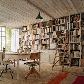
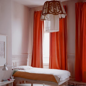
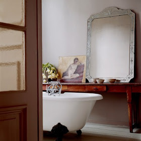

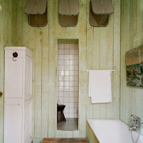
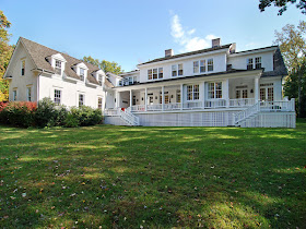
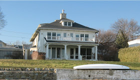
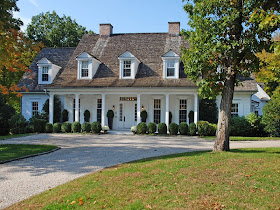
 This lovely home in Greenwich, Connecticut was recently featured in CT Cottage and Gardens.
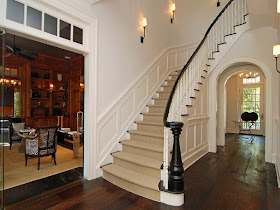
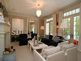
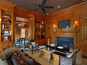 Off to the left of the entry you can see the Library. Advertised as an antique English pine library with adjacent game room with wet bar; the detail is amazing. I am a stickler for symmetry so I really like the two doors on either side of the fireplace. The brown painted ceiling adds a coziness to the 11 foot ceilings. I also love the jazzy zebra chairs to lighten things up bit. Flat screen TV above the fireplace makes me think this is a real recreation area for the family. You can see an air hockey table through the french doors.
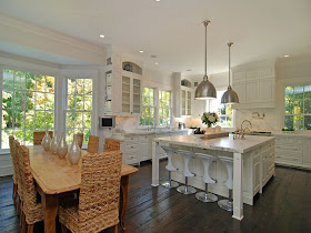
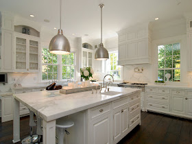
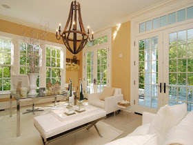
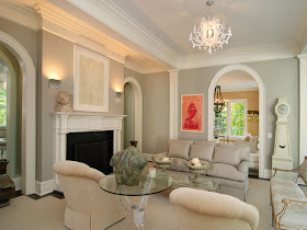
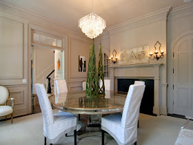 The Dining Room is beautiful. I love the off white/gray wall tones. Mirrored table and huge fireplace surely make for sparking, magical dinner parties. The Chandelier looks a bit small for the space. I would also like to see more artwork. Perhaps the owners have replaced the light fixtures, prior to listing the home.