 (l.pasquier)
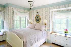
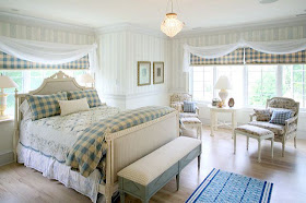
I have always been enamoured with sheers. I love the romance and natural light they let into a room.
 (National Curtain Company)
They soften hard lines and provide a beautiful fluid motion from a breeze. Here is wonderful example of antique shutters which are enhanced and softened by the striped sheers.
 (o. disegno)
When the light is right, sheers can create an incredible romance in a room. Even a room that is dark can be brightened with sheers. I included the room above to show, though dark, how even a north facing room can benefit from the natural light.
 (Southern Accents)
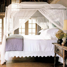
When I was twenty and in my first apartment I bought a huge mosquito netting to hang from the ceiling over my mattress which sat on the floor. I did not even own a bed then! I envisioned myself chic like Mata Hari. This picture is much better example of what I was trying to achieve back then. This Niermann Weeks beds is gorgeous with the gathered sheers. Isn't this so romantic?
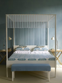 (c. everad)
This canopy is taunt - creating a much more sophisticated and contemporary feeling. This is a simple and inexpensive way to add the romance of sheers to your four poster bed.
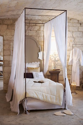 (l.pasquier)
The sheers here create a wonderful juxtaposition to the cold lines of the metal bed. Even in spare rooms such as this, sheers add a layer of softness. If you pull them closed you create a romantic room with in a room.
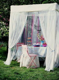 (s. lane)
But sheers can used outdoors to create a room as well. Here we see this lovely dining area become a spectacular outdoor oasis.
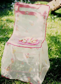 (s. lane)
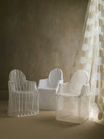
They can also make sweet slipcovers. Here these embroidered sheer slipcovers soften the lines of the french bistro chair.
 (c. everad)
You may remember this photo from a post I did on the popular Ghost chair - you can read about it
here. Even slipcovered the Ghost chair retains its ethereal qualities.
 (p. mitchell)
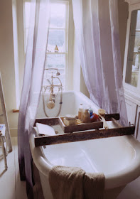
The bath is another area where we are seeing sheers used. I love them as a shower curtain in this space because they provide privacy with out visually dividing the room. Here they are in soft shade of lavender.
 (s. lane)
This sheer shower curtain boasts wonderful ribbon embellishments. Also notice the beautiful table slipcover.
 (s. lane)
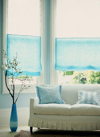
But sheers are not limited to white, here a wonderful turquoise linen provides privacy, as well as the color accent in this room.
 (r. hammick)
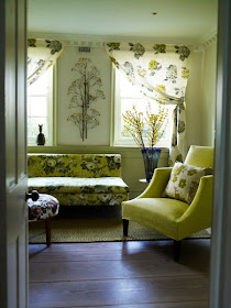
Sheers can also provide the pattern in the room. The light enhances these beautiful floral sheers
(julia clare company)
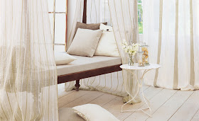
Finally these striped sheers provide a private resting area on an outdoor veranda.
Where do you like to use sheers?
BECOME A WILLOW DECOR SUBSCRIBER IN THE UPPER RIGHT CORNER
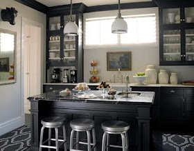
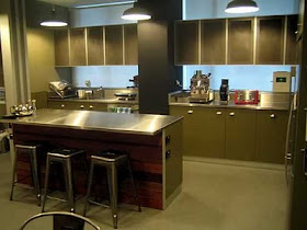
 What I like: Aesthetically I like their lines and the way their color ties in with the stainless steel in the kitchen. I love how four stools (and children) fit. I also like how they push in and make a clear pathway for walking by. I don't like how cold they are to sit on in the morning and how uncomfortable they are with out a back. I also worry they are just too industrial looking (a family lives here after all!)

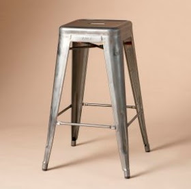 The Tolix stools are available through


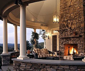

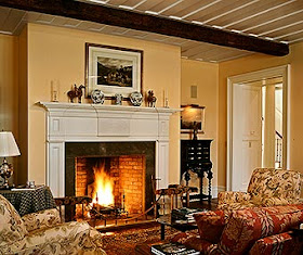 The Living Room is awash in warm historic colors of mustard and russet. Notice the ceiling detail where 200 year old hand hewn beams were used and the beautiful century old reclaimed hardwood floors. Also notice the deep transition doorways between the Living Room and Foyer. This adds immensely to the historic feeling of the house.
 The formal main entry is very large and flooded in natural light. It provides a neutral backdrop for the home owners folk art collection.
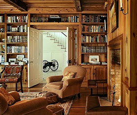 On the opposite side of the foyer you enter a warm and inviting library. The wood shelving, hand hewn beams and antique flooring make you feel like you are in a room at least a century old. It is hard to believe that this is new construction. Again notice the deep transitions in the doorways.
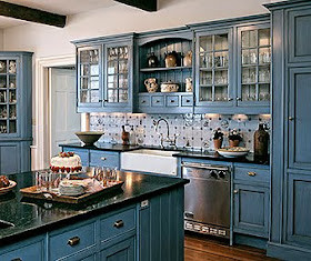 The home features a soft blue kitchen. Though not my taste it is an interesting departure from the usual white cabinets. The blue is a wonderful compliment to the antique floors and stainless steel.
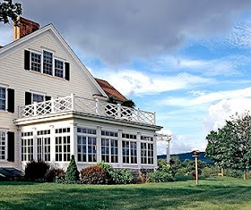 Artfully designed to look like an addition added over the years, no "historic style" home is complete without a sun room. This one is so lovely. Notice the railings, the exterior column details and the pergola. Nothing was missed - I am in love with this!
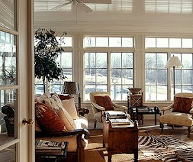 And it is every bit as lovely inside with incredible moulding details and beadboard ceilings! Great furniture choices, with a mix of antiques and a zebra skin layered over a sisal rug. Also notice how the placement and height of the tree and then tall lamp carries your eye around the room.
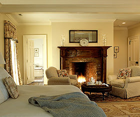 The master bedroom is beautiful. The highlight is the fireplace, again a wonderful job of making the room look very vintage. Notice the hand forged hardware on the doors.
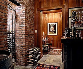


 Did you ever wonder who actually lives in those homes that are shown in the magazines? Or, what happens when the actual owners decide to move? You might recognize this home from an older issue of Better Homes and Gardens. It is located in North Carolina and is currently for sale. I was over at
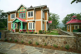
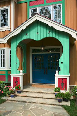
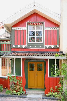
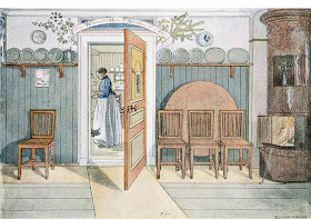
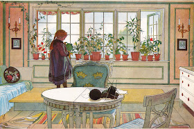 Much like America's Norman Rockwell, Larsson became quite famous by depicting the images of everyday life in his artwork.