Monday, January 31, 2011

Design Trends!


The final installment of my trip to Market was to look at the overall design trends for 2011.


We saw a lot of furniture that mimicked Tara Shaw Maison and Aidan Gray - some were more rustic like Restoration Hardware, some were more chippy and distressed. There were a variety of price points and quality. But if you are interested in this look you will be able to find it at any price. My only caution when shopping is to look at the finishes - some of these vendors are doing great work that looks authentic and others are not. I was very impressed with almost all the pieces from BLISS (above) - they were my favorite vendor for quality versus price.

We continued to see in almost every showroom neutrals and linens. This bedding ensemble from Legacy Linens was just beautiful.

But the one new element we noticed the most was the introduction of more organic and textural type materials. We saw more rattan, raw wood and specifically we saw a lot of driftwood/wood.


We saw wood made into sculptures like this wonderful horse -


And this large seahorse!


Pieces like this mirror were in several showrooms but Currey and Company seemed to have the best selection and the best quality.


Here it is with several lamps with wood bases.


This large mirror was just striking - and notice the chandelier in front.


They had several other interesting Chandeliers like this trellis style.


We fell in love with this standing lamp - we loved the texture and scale.


Their smaller lamps were also interesting. They had several styles like this ball lamp.


and the figure - we loved this one.

Over all we saw little departure from the past year - most vendors playing it safe and neutral with lots of gray, taupe and brown. It was a great trip and I came back even more inspired than before, with many new sources with quality products. I would be interested to hear how you all feel about seeing more of this look and your thoughts on trends for 2011.

(all photos Willow Decor not be copied without permission)

Friday, January 28, 2011

Tara Shaw Maison - America's Mart Part III


One of my most favorite areas at the Market is the "High Design" section. It houses beautiful temporary showrooms dedicated to those designers that have very exclusive lines. Of course Tara Shaw was there, amid a backdrop of chocolate brown walls, with the most beautiful furniture.

It was so fun to see my friend Tara Shaw again! As usual her "Maison" Line stopped everyone in their tracks. She has added over thirty new pieces and her beautiful collection has over 75 items now. Let's have a look at some of my favorites:
The Italian Grisaille Panels were just stunning. You all know how I love Grisaille (to read my post on Grisaille click HERE). These panels were almost a perfect pair in gorgeous sepia tones.

Her new upholstered pieces were also beautiful. I loved this Italian Monogram Chair. It can be custom monogrammed to your specifications.
People were buzzing around the Baroque Canape - the back is removable so it is like two different pieces in one.


The silver leaf bench had a much more beautiful finish than my camera captured and look at all that hand carving.


The Italian Fragment mirror would be a fabulous focal point in any room - it's beauty really commands attention.

It was hung over this Italian Buffet. The finish of soft blues and golds were just extraordinary.


Of course she also had her signature lighting, but this Gilded Iron Corona Chandelier really caught my eye.
And the popularity of her small crowns prompted her to create this Corona on a stand. So many beautiful new things to see and wish for!! If you are interested in purchasing any of these fabulous items do let me know and I can send on pricing and shipping estimates.


By the way , my friend Millie, of M Design and Consultation, is now Tara Shaw's exclusive Interior Designer, you can contact Millie HERE. You can read all about my visit to New Orleans with Millie HERE. And my previous post on the Tara Shaw Maison Line HERE. To visit the Tara Shaw Maison website click HERE.

See you in few days with my final post - Trends at the Atlanta Market. Until then I will be shoveling out from under another Boston snowstorm!! Did I mention my back hurts??!!

Thursday, January 20, 2011

America's Mart International Home Furnishing Market -Part I - Bobo Intriguing Objects

What a fabulous time I had in Atlanta this past weekend. I traveled with my BFF, Diane who is a Designer in Virginia Beach. We just had so much fun!! "Di"and I also met up with Millie, my Designer friend from New Orleans, who is now the exclusive Designer for Tara Shaw, but more about that later in the week. (You can read all about my previous trip to New Orleans to shop with Millie HERE). We spent three LONG days visiting showroom after showroom and seeing the most recent products and trends for 2011.Over the next week I will profile several of my favorite stops. Today lets have a look at the amazing items from BoBo Intriguing Objects. You might remember that BoBo is the brain child of Mark Sage and Rudi Nijssen, the celebrated designers/manufacturers that have recently partnered up with Restoration Hardware. You can read a great interview with Mark Sage by Brooke at Velvet and Linen HERE. Mark also owns Love Train Antiques, but unfortunately I did not have time to go there this trip. Let's have a look at the Bobo Showroom. I was so charmed by these wine jug sphere pendent lamps. I loved the installation of several sizes hung together. Also notice the ceiling mounts, they were beautiful and a perfect compliment to the fixture. This is where Bobo always sets themselves apart; they do not skimp and have a wonderful attention to detail.
Mark is a master of "the collections", and these domes really caught my eye.
Also these wonderful copper pails - You can do so much with these - I envision them with plants and food, and silverware. Beautiful catch-alls in a boy's room or mud room - How about a set on bench filled with mittens and hats??? The table was also a find. I adored the metal detail that wrapped around the edges.
Another collection that really caught my eye was the mercury glass cake stands. Again these lend themselves to so many different uses. The wood carved angel wings really make a statement as well. Can't wait to find the right client's entry or console table to display these beauties.
I love all things with a Swedish flair and the Halo crowns remounted on metal stands really resonated with me.
Of course it wasn't all Home Decor for us - Di and I met a few celebrities as well! Here we are with Cat Cora from Iron Chef, who just launched a new line of cookware! She is a such a tiny little thing in person (remember I am only 5' 2"). Cat is on the right and that's Di on the left.
We also got a chance to finally meet and have lunch with Holly of Things that Inspire. Holly and I have been blog friends for years and it was such a treat to finally meet her in person. Her blog is one my favorites, you can read it HERE.


I have several other great finds to share with you, as well as some trends and other exciting things from Market, so keep checking back!

Tuesday, January 11, 2011

Gorgeous Downsizing

Recently there has been a huge increase in the news that the era of the McMansion is coming to a close. It is said that as the baby boomers move into retirement many are wanting to downsize. Of course downsizing immediately conjures up images of a smaller cramped and uninteresting house, but not if you are acclaimed architect Peter Zimmerman. A master of proportion and scale, Zimmerman, generally designs larger homes, but was intrigued about developing a home limited to 2,500 square feet. This home is part of a community of smaller homes in Pennsylvania.
Notice his great attention to detail - the thicker clapboards, copper gutters and balcony millwork. Which is echoed inside in the loft millwork. Here is the view from the entryway Though not grand in size, the open floor plan gives the illusion of much larger space. The larger scale of the fireplace balances the cathedral ceiling height. Notice the wall of built ins; the home was thoughtfully designed with lots of storage. Furnishings are neutral, using primarily linens and seagrass rugs to bring more texture to the space and enhance the gorgeous barn beams and beadboard ceilings.
Right beyond the dining area is the small kitchen with center island. The window placement and the walkway/hallway between the two spaces adds to the illusion of a larger kitchen.
Off the great room is a cozy study with another fireplace. The master suite is on the first floor and the house has a loft with two additional bedrooms. With a home so thoughtfully designed and wonderfully decorated it seems to easy to downsize. To read more about this beautiful home click here. Readers, what are your thoughts, is downsizing the trend for 2011?
.

Also thanks to Sherri of Inside Out Design for the Stylish Blogger Award - Head over to her blog for some great inspiration!
(photos New Old House Magazine)

Saturday, January 1, 2011

Light Up The New Year with Fire and Ice!!

Happy New Year!! We will be outdoors tonight enjoying some fireworks on New Year's Eve. We will be watching them from a dear friend's beautiful outdoor patio. I was trying to come up with a wonderful hostess gift and decided to make some Ice Sculpture Luminaries.
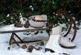
I have always been fascinated by the the combination of Fire and Ice. I love the warm ambiance it creates. Of course they can be made with just water, but I love the rustic feeling the addition of evergreens and pinecones bring. Here is a wonderful how to pictorial I found:
You need two bowls, one much larger than the other. Fill 1/3 of the large bowl with water. Add pinecones and evergreens.
Place the smaller bowl inside the larger bowl
Weight the smaller bowl down with a large rock. Freeze several hours outdoors or in your freezer - it's been so cold that for us outdoors works fine!!
To unmold run warm water over the larger bowl to release ice sculpture. Add a candle and enjoy!
Happy New Year, my friends!! Looking forward to sharing even more wonderful things with you in 2011!!
(photos Southern Living & Bolig)