
 Pick up a copy of England's House and Garden or Home and Gardens' Magazines and you are sure to find the work of Interior Designer, Helen Green. She has wonderful streamlined, sophisticated style. Green describes her style as cool contemporary, modern, precise, harmonious and elegant. Above is London Triplex she recently designed for client.
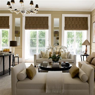 Her palette is often soft neutrals, which we all know I love here at Willow Decor. Green mentioned in a recent interview that in central London, with the homes interesting architecture, she felt color doesn’t really work. "In a sophisticated house where you’ve got a sophisticated palette of greys, for example, splashes of colour like a red cushion doesn’t work for me." Having moved into a historic home with many interesting architectural details I have also found myself moving toward a more neutral palette. Like Green, I felt this was a better way for the room to reveal its exceptional bones.
  This is such a wonderful dining room. I adore the gray blue color scheme. Green keeps the architectural details the focus of this room but enhances them by accenting them with mirrors. Notice the mirrors incorporated into the wall panels above. And, if you look again at the living room photo above you will notice mirrors built in, flanking the windows.
 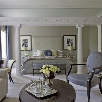 I love this master bedroom. The room's architecture is front and center and beautifully enhanced by a soothing palette of beige. The furniture is a mix of what we call classic contemporary. (The silver hot chocolate pot and the roses add the subtle bling!)
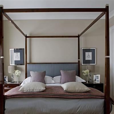 Above is the Guest room -streamlined, sophisticated and very inviting.
Now let's have a look at her own personal residence in London. It is always interesting to me how a designer's home often parallels a clients. I prefer to work with clients that have similar taste and want to achieve a similar design aesthetic. The process becomes more exciting for me, because finding the perfect fabric, paint, or marble for client I get as excited as if I found it for myself.
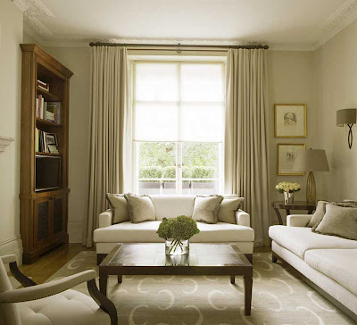
Here is Green's living room. Again the palette is soothing, drapes match the walls for softness, and the focus remains on the beautiful furniture and the rooms mouldings and window. Green herself defines her house as the reflection of "a modern-classic style achieved by means of a selection of contemporary furniture and a collection of antiques, drawings and paintings".

The master bedroom is elegant is soothing. The blue color, chosen for the silk-upholstered walls and sofa, contrasts with the darker shades of the rest of the furniture.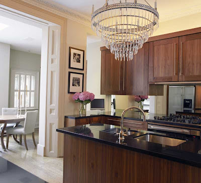 One of the designer’s favorite rooms is her kitchen, a spacious area that looks out onto the beautiful gardens. Though I personally prefer a white kitchen, I do like Green's cabinets. I think the wood tone is very rich and the crystal chandelier gives the space and unexpected glamour. Notice how similar her dining chairs are to the ones above in her clients dining room.
 Here is a photo of her lovely garden and entertaining area. No wonder she loves the kitchen looking out onto it. This is a place that reflects her maxim in interior decoration: "always follow your own instinct" Sophisticated and elegant.
Green has launched two wonderful furniture lines and has a line of carpets and fabrics. For more of Helen Green's work and her furniture check out her website here.
(all photos Helen Green London)
For me, I think it is the symmetry of her work that gives that sense of harmony. Her outdoor entertaining area has been at the top of my favourites since I first saw it. Wonderful images, thanks so much for sharing them.
ReplyDeleteAnge
Beautiful, soothing color palette!!
ReplyDelete:) T
this lady's work is amazing, so gorgeous, although I couldn't help but think to myself when I saw the curved lounges in the living room set, "I wonder what my kids would make of that room if I let them loose in there" - and the answer is, of course, a mess - no more symmetry after they'd been there 10mins!!!
ReplyDeleteReally beautiful these interiors of Helen Green! Indeed the neutral colours are always good! I adore the master bedroom! So elegant and feminine!
ReplyDeleteGreet
I love these rooms too, xv.
ReplyDeleteWhat a beautiful post. I too gravitate to neutral, and if there is color, it is pale and subtle. Love her look, thank you for the introduction!
ReplyDeleteSO beautiful and in my favorite colors. The outdoor dining area is spectacular.
ReplyDeletexo Isa
One of most favourite bathrooms ever, ever is a Helen Green. Oh excuse me while a wipe away a tear, any mention of the B word in our house at the moment evokes a tear ot twenty, as MOTH is dragging his feet with our B renovation & it's still a half-completed wreck!! Lovely post giving neutrals their well-deserved star position Gina.
ReplyDeleteMillie ^_^
Great post! I am a big fan of hers since I started buying the British decor mags. Her style is a little glamourous for me, but I am drawn to her neutral palette, her wonderful focus on the architecture (always great bones, isn't she lucky?!), interesting details, and such. The furniture can be a little too modern for me, but there is something really captivating about her look. I would say she's in my top 5 favorites right now!
ReplyDeleteGreat collection of pics! xo Terri
Again, I really like your blog! We can see a lot of style here, you can realy choose the photographs you post!
ReplyDeleteThese were amazing, so simple and sophisticated. Love it, love it, love it!
Thank you so much for posting about Helen Green. I confess that when I was living in the UK, I never saw her work featured, so I had no idea who she was. Not anymore! The architectural details are what makes these spaces so wonderful - and they are a dime a dozen in London! Amazing to think about, isn't it? Anyway, I love her palette and her sophistication.
ReplyDeleteLovely sophisticated rooms -- the sorts of rooms I can admire, but don't want to live in. Give me color. And that's why there're choices!
ReplyDeleteCass
I adore that gray DR, and the mirrors built in are a very nice detail.
ReplyDeleteSome of the neutral for me is too neutral. I like to have color splashes.
She is a beautiful designer however!
xo
i like the first few images the best.
ReplyDeletethe cafe colored walls and the fabrics are very rich.
xx
wonderful images...such serene wall colors
ReplyDeleteI would love to paint the panels in my dining room the same color. Any idea what she used in the gogeous gray dining room?
ReplyDeleteI bought the Homes and Gardens March 2011 issue, hoping to find a source for the pillows you used in your renovated bedroom. Wondered if you would share your source or maybe they are one of a kind? bkkruiss@hotmail.com
ReplyDeleteI love all the textures and neutrals...very calm and beautiful.