
Tara Dennis
With so much focus on burlap and antique grain sacks we are starting to see a trend using other utilitarian products in home decor.

google
Lately I have started to notice jute upholstery webbing, usually hidden inside sofas and chairs, in the most unexpected places.
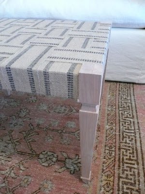
I was just over at Velvet and Linen admiring the new bench that Steve
Giannetti had made for a client in Maine. The bench top is woven with jute upholstery webbing. It reminded me of my Father.
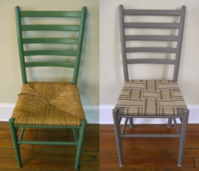 The Long Threads
Many years ago my father found a huge box of upholstery webbing at the dump. As a child of the depression, and not one to waste, he rightly scooped it up and brought the box home. Similar to the photo above, he took chairs with broken rush seats, probably also acquired from the same dump, and wove new seats out of the webbing. We used them for years in our cottage on the Cape. Click the picture link to learn how to do it yourself.
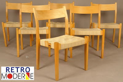
Of course it wasn't a unique idea-Scandinavian designers have been using cloth webbing for ages.
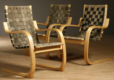
Both photos above from Retro
Moderne give you the basic idea.
Better Homes and Gardens
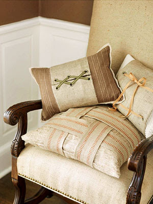
But I am really intrigued when I see the upholstery webbing in more unexpected places. Here are some fabulous pillows -adding some webbing is a simple way to bring the burlap look into your home.

Little Byrd Vintage
This pillow above is wrapped with one length of webbing. The webbing costs about .50 cents a yard - so wrapping the pillow this way is very inexpensive.
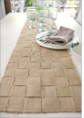
Here is a fabulous jute table runner from
Tara Dennis. Click on the link to learn how to craft this yourself.
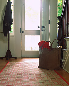
Always in the front of pack in terms of trends is
Martha Stewart, with this lovely webbing hall runner. The link will also show you exactly how to make one for your home.

If you're feeling really crafty you could stitch up a few of these jute webbing napkin rings.
ahn min
I prefer the webbing when it is woven. This is a photo of a display wall in Anthropologie. Not sure how this would translate in everyday living, but its an interesting look.
This is the back of wonderful headboard designed by Steve
Giannetti. It is so pretty I think I might want to display it this way.

Here is another shot of Steve's bench. You can learn more about both projects at Velvet and Linen. The headboard
here and the bench
here.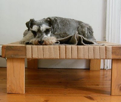
This little pooch looks happy on his new upholstery webbing bed - very clever!
You can find instructions to make your own at
Jezze
northeast stage
I really like the webbing detailing on this curtain - great for a play room.
Here the webbing is used as a background for art at the
Shabby Nest.

Here is an interesting bag from
Hoganfe, a seller on
Etsy. The webbing is used around the drawstring top.

Finally we see a mix of webbing used in other ways from Sadie Olive - to the left is a memo board weaved with webbing and the lower right picture shows the webbing wrapped around a stack of antique books. Charming.
I'd love to hear about any other creative uses for this inexpensive material!
Check out Southern Hospitality for other great ideas here !!
 I am excited to keep posting about all the things that inspire me in home decor and design both here in the US, and internationally. I hope Willow Decor continues to evolve and change as I continue to grow and learn. I know exciting things are just around the bend!
  I thank you for reading and commenting, and sharing this journey with me. It has been a gift beyond my greatest imagination.


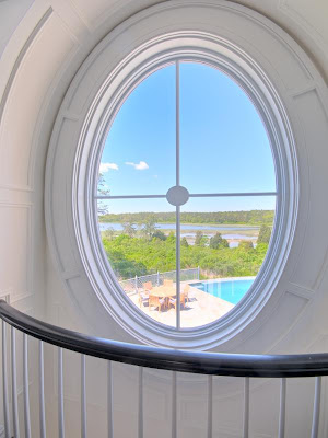
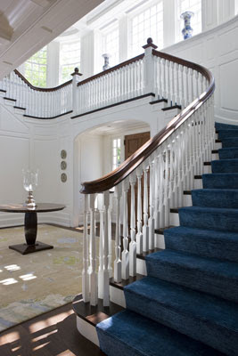 A beautiful entryway with incredible light. Notice the moulding details on the staircase and around the windows.


 What a spectacular wedding my sister had last night at Mielcke & Hurtigkarl. This gourmet restaurant is located in the beautiful Frederiksberg Have of Copenhagen. The location and restaurant were as impressive as the outstanding gourmet food.
 Here is the entrance to the restaurant and the lovely outdoor gardens. The gardens were spectacular and we had our cocktails there when we arrived. The children enjoyed playing with the peacocks which roamed the grounds. But the gardens were the most beautiful under the stars. We were warmed by the outdoor fireplaces while we had after dinner drinks
 We finally arrived and here is just one of the beautiful chalets I see while looking out at the alps. So much inspiration at every turn. Can't wait to share more when I return!
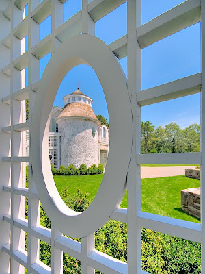
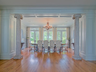
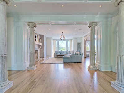
 The house was designed by the renowned designer Fritz Kreiger. For three years craftsmen worked on his vision to create this spectacular residence. He incorporated many antique elements such as doors, columns, and windows into the design. The home is being sold fully furnished with the finest collection of antiques and appointments. All photos are from Sotheby's. The main house has 12 rooms, 4 bedrooms, 6 full baths and 2 half baths with over 7,928 sq. ft. It sits on over 7 and a half acres. It also has a guest house on the property.

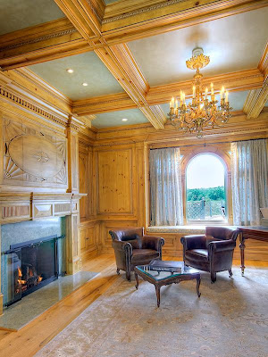
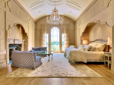
 Here is a close up picture of the French doors.
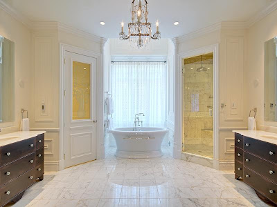
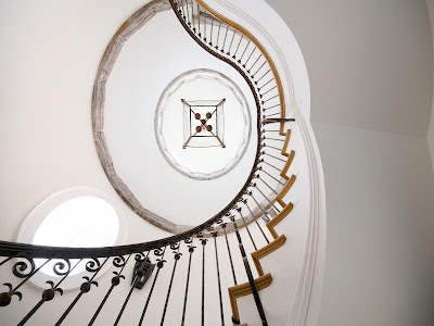

 I have been running crazy trying to get ready for my my sister's wedding in Denmark and then hiking in Switzerland. Packing for the kids, finding temporary homes for the dog and the fish, well you all know how it goes - I will need a vacation after all this!
 Here is a wonderful space. The architecture of this room is lovely. Notice how the built in art niches mimic the lines of the doors and the windows. I also like how the interior wall creates a room with in a room.
 I could relax in this simple room. The wood ceiling and walls, as well as the stone fireplace, bring in the texture. I would prefer something larger over the fireplace though.
 This kitchen cozy. The wood counters warm up the space and the green acrylic stools and matching pendants give it a bit of unexpected personality.
 Here is one of my favorites - first, notice the curve in the ceiling. I love the wonderful old cupboard, french doors, linen shades, saw horse style table and slate floor. Are those chairs from Slettvoll? I could certainly relax and enjoy a latte and chocolate croissant in this dining room.


 I was just over at Velvet and Linen admiring the new bench that Steve
 Of course it wasn't a unique idea-Scandinavian designers have been using cloth webbing for ages.
  Both photos above from Retro

 Here is a fabulous jute table runner from
  Always in the front of pack in terms of trends is


 This little pooch looks happy on his new upholstery webbing bed - very clever!
 Here is an interesting bag from