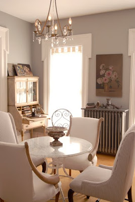
We are so fortunate to be able to speak to Dominique Browning, former editor of House & Garden Magazine!
.
Since House & Garden, Dominique has been very busy writing books and recently joined the world of blogging. Her new book, Slow Love - how I lost my job, put on my pajamas and found happiness, is a wonderful touching memoir of her journey after leaving House & Garden and her steps toward self discovery. With thoughtful, honest insights she shares her struggle toward self awareness and peace. You celebrate her small triumphs, and share her fears as she moves forward into new, uncharted territory. Traveling along with her you are able to also slow down and rediscover the wonder and beauty of the world around us. Her words resonated so strongly with me that I just couldn't put the book down. I loved it!
'
So imagine how thrilled I was when Dominique was able to share with us a few more of her thoughts and insights on design and enjoying the process.
 WD: You have been watching home design trends for many years. What do you consider timeless and classic?
 DB: I've decided it doesn't have to do with style or period--things Baroque and things ultra modern can be classic. It has to do with integrity: things well made, and designs to themselves, fully exploring and expressing what they are. So, an elegant modern sofa by Billy Baldwin looks great now, and did fifty years ago. And works in a contemporary room, or in a room full of Fine French Furniture.
 WD: What is the most favorite room in your home -what details make it so special to you?
DB: Any room that has books in it, and a comfortable place to read. The details I crave: a table near a chair for that cup of tea or glass of wine. A soft, thick throw for my knees, or around my shoulders. A jewel of a pillow to brighten the air, and fabric that is not scratchy or irritating. And, finally, what I call an intimate landscape nearby--some small configuration of vase, sculpture, stone or bird's nest--anything, found or precious or both, that your eye can rest on, and your imagination can wander over.

WD: What are your favorite places to find inspiration for both your home and garden?
DB: I LOVE consignment shops, and have found treasures galore in what people are casting off, particularly if they happen to be in wealthier neighborhoods!

WD: With the struggling economy and many home owners having to stay longer in their homes than they may have wanted; what advice would you give to them regarding refreshing their spaces?
DB: Staying longer in a home would never be my problem! The longer you are home, the better your house becomes. Keep adding things you love, and they don't have to be purchased. They can be found objects, from walks in the woods or on the beach. Of course, an ever-changing pile of photography books goes a long way. And so does simply reupholstering ONE armchair. Or, getting a new set of towels in a vibrant color that you never would have used before. Amazing how small things make a big difference.

WD: How have you made the transition from critiquing rooms to really enjoying them?
DB: I have always enjoyed my rooms, and I'm still critiquing rooms! Just silently, muttering under my breath!  WD: So often I hear from friends and clients "I just want to get this room done!" What tips can you share to help us enjoy the process as well as the outcome?
DB: First, start ripping pages out of magazines, pages with ideas that catch your eye. Don't edit yourself ahead of time. If your pulse quickens, rip. Then look at what you've got, find shared themes, and head in that direction. NEVER keep working with someone who makes you feel insecure, dumb, frightened or confused. FIRE AWAY! Don't wait for a crisis. This is when breaking up is easy to do. And enjoy it at your own pace--some people need to work slowly, one piece at a time. Others want that "magic wand" feeling--everything done at once. Stay true to yourself. And do not let yourself get talked into living with something you don't like. You wouldn't do that with a partner, would you? So why would an armchair be any easier?

WD: One of the many themes in your new book is your fear of change and the unknown. What words of advice do you have for others who share those fears, and how can they make fear become a positive catalyst?
DB: Don't run from fear--that's what I learned hardest. Stay with it, examine it, look deep into that dark heart. And start learning and changing. I have some bad habits (like always beating up on myself, internally--that horrid little voice that says nothing is good enough) and those habits kept me in a semi-fearful state. So I have had to literally talk myself through them, and train myself to change my ways of thinking.

WD: What are the most important things you have learned about yourself while writing your new book and blog?
DB: I LOVE blogging! I resisted it for years and years, back in HG days! I guess I just wasn't ready for it. So I learned something very important, both in my new online writing and in writing the book. Don't hold back. Life is short. Make the most of whatever gives you pleasure.

One of things I have missed the most from House & Garden is Dominique's Editorial Letters. I am so thrilled that her new blog,
slow love life brings her conversations and touching insights back to us again.
'
As I mentioned,
Slow Love, is a wonderful book! We are so fortunate that Dominique has given Willow Decor a copy for one of our readers. (or you can purchase it
here) Just visit her new blog,
slow love life, and come back here and leave a comment. Next Sunday I will choose a random comment and send off the book. I know you will enjoy both her blog and her book as much as I have.
'
Finally a very special thank you to Dominique Browning for sharing her time and thoughts with us! So thrilled she part of the blog family!!
.
(Photo credit: NY Times, House & Garden,Coastal Living, Iowa Garden, House & Garden AU) 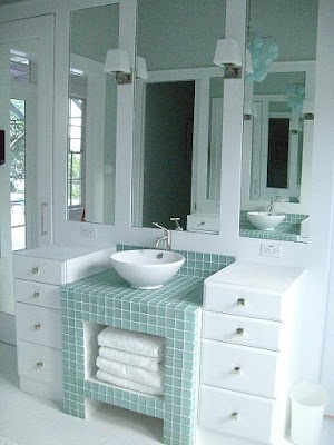 Almost every one needs more storage in their bathroom. Perhaps we all need to get a bit more organized, but if you are clutter challenged like me, I wanted to show you some wonderful baths by designer, Molly Frey. You may remember a previous post on a fabulous coastal house by Molly here.
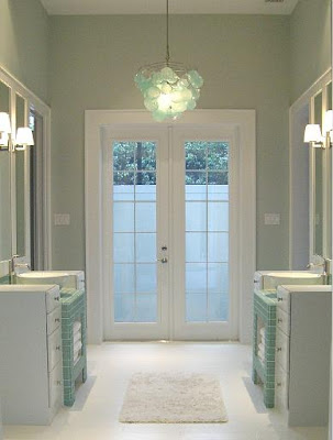

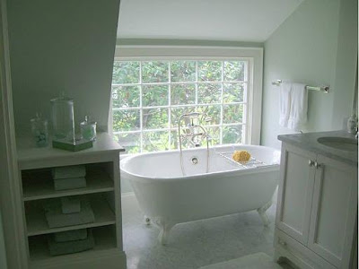
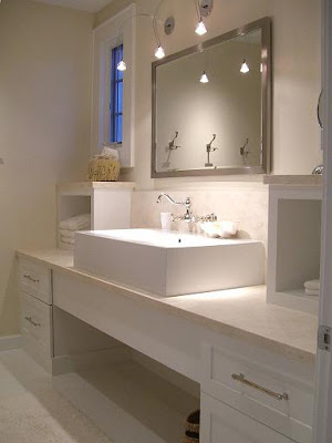 Here is a more streamlined, contemporary feeling bath. Two small boxes topped with limestone add the additional storage here. By not putting small doors on these, the look stays very open and contemporary - Interesting!
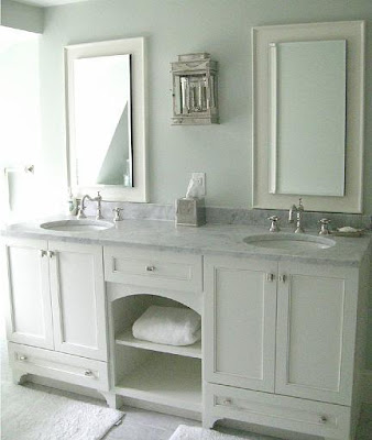
 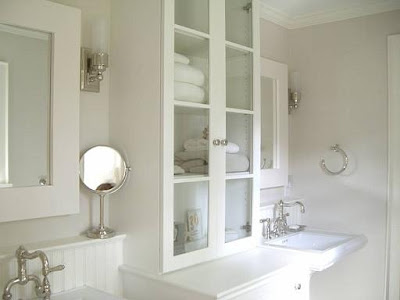 A more traditional design also shows you some ways to increase storage. Here the cabinets flanking the pedestal sinks sit directly on the counters. Unlike a kitchen, counter space in the bath can be more narrow to support your toiletries. The small ledge behind the sinks also add a space for lotions and creams.
 Here we see a shallow medicine cabinet with mirrored doors built into the design. Not only is this cabinet functional, it becomes a wonderful focal point. This bath also has "feet" on the cabinet base.
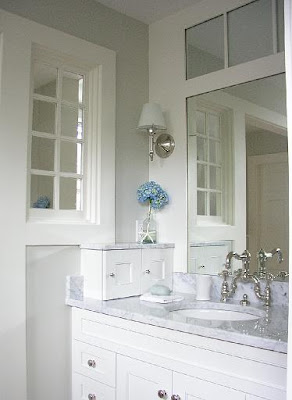 The final bath has this cute little cabinet on the left side. A great spot for a razor and shaving cream - or perhaps it hides electric outlets and a blow dryer.


 WD: You have been watching home design trends for many years. What do you consider timeless and classic?
  WD: What is the most favorite room in your home -what details make it so special to you?


 WD: So often I hear from friends and clients "I just want to get this room done!" What tips can you share to help us enjoy the process as well as the outcome?

 Here is the exterior of the home. Of course it is beautiful, but interesting things to note are the the roof lines and the use of multiple materials. Stone, cedar siding and wood accents and doors are featured prominently.


