 I was with a client today an we were re-configuring her kitchen. Even though her renovation was done over ten years ago, the kitchen was very well thought out. She has a beautiful space with almost an entire wall of windows above her sink. The design was ahead of its time. We need to replace her cabinets, but discussed not replacing the few upper cabinets she has, and allowing the wall of windows to be the spectacular focal point in her room.
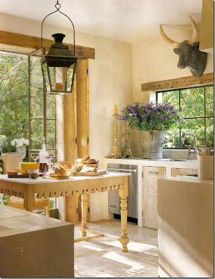
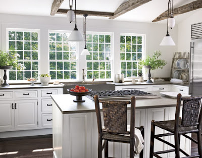
No upper cabinets seem to be a trend these days in kitchen design. Notice the wonderful kitchen above designed by Pam Pierce (via Cote De Texas). Light floods in and the windows become wonderful eye candy.
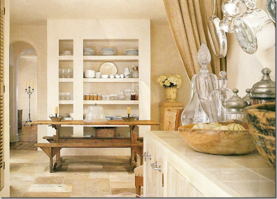 Another angle of Pam's kitchen reveals this storage shelving unit, built to make sure she had enough storage space, but notice she did not add doors.
 Thanks to Linda Merrill of Silver Screen Surroundings, here is a photo of the kitchen from Nancy Meyers new movie, "Its Complicated". Always a trendsetter in set design we see no upper cabinets in Meryl Streep's character's kitchen. Will this become as copied at the "Something's Gotta Give" Kitchen?
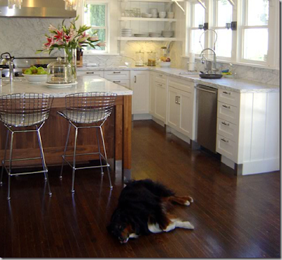
Here a kitchen from Katiedid also has open shelving. The effect is light and airy.
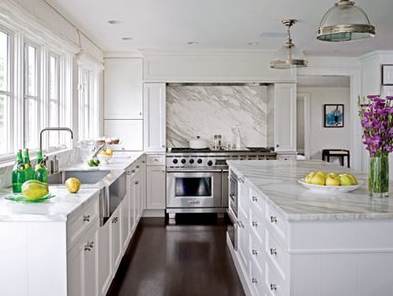
(design esquire)
We are also seeing this "little to no upper cabinet trend" even among the Christopher Peacock look alike kitchens. Here we see upper cabinets just around the stove, leaving the wall of windows as a striking feature.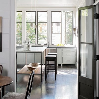

We generally see the old upper cabinets being replaced by extra windows. This kitchen from Southern Accents is a perfect example. The windows versus upper cabinets trend is not limited to one type of style either. Here we see it in a more contemporary kitchen.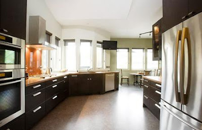 I included this other contemporary kitchen from Ryan Jackson even though it has a few upper cabinets because the back wall of windows really illicit a similar feeling to the kitchen above.
 I included this other contemporary kitchen from Ryan Jackson even though it has a few upper cabinets because the back wall of windows really illicit a similar feeling to the kitchen above.
I find I prefer no upper cabinets in more rustic styles. Here in this French country kitchen (via Cote De Texas) upper cabinets would have definitely taken away some of the ambiance. 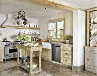

But not all kitchens with out upper cabinets have a wall of windows or 10 foot ceilings. This kitchen (via Cote De Texas) for example has just one window. The lack of cabinets though, give the space a larger more open feeling. A wonderful antique cupboard and hand hewn bean shelves make up for the lost storage space.

As usual, another gorgeous room from Brooke and Steve Giannetti at Velvet and Linen. This kitchen is another example of no upper cabinets, and without a wall of windows. I love the post and beams and the earthy feeling of this space.

But, nothing beats bringing the outdoors in with out any distractions. And, with the cathedral ceilings this kitchen from Jill Brinson is really stunning. Again we see some open shelving storage. The wrought iron shelf brackets echo nicely the steel windows and center island table.
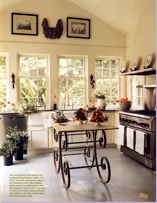
Another cathedral ceiling, and wall of windows -This kitchen is really beautiful.


Here is a more country farm style kitchen from the Lettered Cottage - and again the results really flood the space with light.
 Another more traditional style kitchen from Crown Point- As you can see the wall of windows over the sink seem to work in so many different decors.
 This kitchen from Country Living is one of my personal favorites - simple and beautiful.
 Another more traditional style kitchen from Crown Point- As you can see the wall of windows over the sink seem to work in so many different decors.
 This kitchen from Country Living is one of my personal favorites - simple and beautiful.
 So readers, do you think this is trend that will stay around for a while? As a lover of light, I do hope so!!
Read more on this topic at The House that A-M Built
.
Read more on this topic at The House that A-M Built

Oh I hope so... I think it's a trend that's time has come!! This being said by someone who has no window in her kitchen :(
ReplyDeleteAll the kitchens you featured are beyond stunning!!
Thanks for sharing
I love this trend, and I hope it's here to stay. Thanks for the great round up of pictures!
ReplyDeletewell I'm with you 100% and def an ongoing trend with more stylish homes, we just built our home, and of course the builder says "yes and we'll put in upper cabinets right along for no extra cost", so we of course say "great!". But reality is, for a stylish kitchen, lose 'em! Needless to say, we hardly use them, and shelves would have def been just as effective as what we've got. Storage is great, but upper cabinets in a kitchen, could be easily incorporated elsewhere better - imo anyway!
ReplyDeleteMy aunt's kitchen, in Ediburgh Scotland, has very few upper cabinets - and has been this way for decades! Although I don't know if this is how it is done in Europe (and Europe is too big to make generalizations), it does seem much more European to minimize the upper cabinets...seems so American to have an overabundance of upper cabinets!
ReplyDeleteI also thinkt hat kitchens are becoming so much more like rooms, and the lack of upper cabinets make them feel much more room like.
In my new kitchen, we are going to have very few upper cabinets in the kitchen - just two, one for dishes, one for glasses. We will have two floor to ceiling cabinets, though, and we will also have storage in the pantry for things like china, Christmas china, large platters, small appliances that are only used once a week.
Many of these kitchens have a huge wall of windows; alas, my kitchen does not have the view to allow for that, so instead it will have a wall of windows near the kitchen table, and windows on either side of the range that look out onto the less private side of the house.
I could look at kitchen posts every day! I see something new every time I look at a beatiful kitchen.
How gorgeous is that kitchen with the dark blue (I think it's blue) window trim 5 pictures up? Just love that contrast with the white walls.
ReplyDeleteI do think this trend will expand in part because our kitchens are more open to surrounding rooms. I think it allows the kitchen to become a more seamless part of the "whole" as opposed to being so "utilitarian". It's not for everyone, however. Beautiful images!
I hope so as well, as it is quite beautiful. I wish that I just had a kitchen that was more than a 1 person kitchen.
ReplyDeleteWhen building, 1986, I remember someone saying, You Can't Do That.
ReplyDeleteIt was about more windows over the sink.
Most often, the kitchen hides fabulous views of the landscape. Because of its cabinets.
Thank you for posting this topic.
Garden & Be Well, XO Tara
I love kitchens with a minimum of upper cabinets, so when I saw your byline I rushed right over to see all of the pictures. Sooooo many great ones too! I am adding them to my "kitchen files"! Thanks so much!! But then to see my kitchen in the group! Unexpected and so very nice! Thank you yet agin. :)
ReplyDeleteOh....It works for me. The last three houses we have lived in the first thing I did was rip out the upper cabinets. It feels so spacious, and light and...right,
ReplyDeleteLoved all of your images...lovely!
OMG what a fabulous post! I am a 'no upper cabinets' girl. I only just did a post on my kitchen a few days ago, noting that the only upper cabinets I put in were to sort of fill some space near the windows. I designed my pantry to hide all the bits and pieces that you would normally place in upper cabinets but also made sure that there was some space for some pretty display pieces. My next kitchen?... all I will ever need for a starting point is this wonderful post! A-M xx
ReplyDeleteI love love love this look. It's timeless and will be around forever. I plan to use it in my kitchen renovation since it makes the room seem much more gracious and inviting. Luckily I have a butler's pantry which provides an abundance of storage. This is a great collection of inspiration pictures, Gina
ReplyDeletexoxo
Love them! That is exactly how I would love to design all kitchens today.
ReplyDeleteAnna :)
I remember loving this look years ago before it was everywhere. It seemed impractical to me then, but I like a lot of things that are impractical. I never had a kitchen that was large enough to be able to do without any cabinet space. I probably could do it now, maybe that will be in my overall plan! I actually have the view for it too! I hope it's here to stay.
ReplyDeleteNope. Never been a fan.
ReplyDeleteI tear them down when I can.
Maybe it's that I am such a klutz.
The head banging and the finger pinching needs to stop.
Wonderful post. I love this look, as long as there is a pantry or other storage close to the kitchen. I think anything that incorporates more windows and sunlight is a good design direction. We may be moving in the next year or two, so I am saving this post!
ReplyDeleteBeautiful kitchens. I like the look of no upper cabinets, but I would have a storage problem in my house if I lost mine. I wouldn't mine that look if I was building a new house though and could plan for storage.
ReplyDeleteThe picture from Country is one of my all time favorites! I love this "trend" but I hope it stays around for a long time!
ReplyDeleteTara's "You Can't Do That" made me smirk a little, because haven't we all heard it? At least, now it's got a name! The dreaded You Can't Do That!
ReplyDeleteAll amazing images. I'm not even sure if we can call having no upper cabinets a trend anymore...they just look so right in many situations. I did remove a portion of upper cabinets when we did our kitchen reno almost 4 yrs. ago. But, open shelves were not a contender for many reasons-storage, layout, etc...I have beautiful leaded glass fronts on all uppers that remained along one wall! Love the weighted pendant lights...I have similar (reproductions) over my island. Loved this post.
ReplyDeleteLight and more light that is always my preference. I think this look works so well in the French design because obviously storage will be needed and in that design format you can add so many lovely ways to store items,pot racks antique pieces. I had the dreaded cupboards over my bar area and we removed them but not until I emptied them out and lived without anything in them for several months. I was amazed at how many things those three cupboards were holding that I could live with by placing in other spots. So, with all that beign said, I think this is a lovely and welcomed trend. Kathysue
ReplyDeleteI need steps on doing this without destroying the other cupboards
DeleteGina~ I agree with you and prefer the look in a more rustic kitchen. Some of the images you shared have been stored away in my 'dream files' for some time now. I would love to knock out the cabinets and add windows to let the light shine into my tiny kitchen!
ReplyDeleteGreat post.
Hugs~
T
Oh how I love light and these beautiful, airy kitchens! I so totally tried to do this in my own home but just couldn't break away from the harsh reality that we just need to hide some of our plastic plates and colorful cups! I did embrace the idea to limit it to just a few, and I do like that look! Definitely a trend that's here to stay given the desire for openness...
ReplyDeleteI've come over to your lovely blog via The House That A-M Built. I mentioned to her that probably the only part of my new kitchen I'm not completely happy with is the upper cabinets. The eye seems to be be drawn to them and they're not the focal point I would have chosen! Fantastic post.
ReplyDeleteI LOVE the look of a kitchen with a bank of windows and no upper cabinets. I especially love it when the windows come right down to the countertop.
ReplyDeleteAt one point during our kitchen makeover, we had to take down the upper cabinets to remove the backsplash. I didn't want to put them back up, but hubby insisted. Men!! ;-)
I say it's a trend that should stay :-)
Kelly
I LOVE the look but here is my question...don't all of the dishes get dusty on the open shelving?
ReplyDeleteI think you might be on to something here. My new kitchen doesn't have any upper cabinets as well and it wasn't an intentional omission either- we did it because that's what seemed right and aesthetically pleasing- although I made up for it in the butler's pantry where the entire space is covered with a row of upper cabinets!
ReplyDeleteI love the look of open shelving or wall space & windows above the counters. The room looks more like a room and less like a plain old functional kitchen where you want to stuff as much storage into one space as possible. I've strongly considered pulling some of my cabinets down. Maybe some day...
ReplyDeleteThose kitchens are fabulous, well one need space to pull it off. My colonial 47's house is impossible to reconfigure, unless you use dynamite...
ReplyDeleteBut a girl can dream!
My dream kitchen is Velvet and Linen's kitchen, I believe once I posted on it, it's divine and all I would want!
~ Victoria
Hi, I hadn't thought about this, but my kitchen back in Belgium (which we installed only 6 months before moving out (sound familiar to anyone?)) does not have cupboards above - well not really. We have quite a modern kitchen which has two cupboards which sit atop the base "drawers" (we don't have cupboards below as such either!) and these have roll down fronts with lit glass shelving behind. Plus, on the long wall, we have the appliances set in a kind of built in large cupboard, two ovens sitting above the fridge and freezer and either side "attached" sand etched glazed doors, again with lighting behind and glass shelves. I would post photos if I only knew how so that you could see. In the middle of all this is a huge island which houses my hob with extractor over and masses of work space. Below are big drawers and concertina doors hiding more shelving. Oh how I miss my beautiful kitchen, pity someone else is enjoying the fruits of our labours, yes, we have tenants in, I hope that they are taking care of it!
ReplyDeleteLove your blog and how lucky you are to have Suzanne as your interior designer, love her work, she is making me think "colour" where I am usually, blacks, whites etc.
Angela x
Please ignore the last paragraph, I think I had read too many blogs today and confused yours with one I read prior to this!!! Please accept my apologies.
ReplyDeleteAngela x
It used to be that a lot of upper cabinets, especially if they were stacked all the way up the ceiling, were a strong selling point. My contractor was stunned when I asked for open shelving on my uppers a few years ago. Wonder what they say to no uppers?! ha. I love this cleaned up trend.
ReplyDeletei am completely on board with this idea,
ReplyDeletemore windows and i don't need a ladder anymore.
at my height of 5'2" ....
everything is too high.
xx
gorgeous kitchens
Shelves are great and open is beautiful.....but ...where do we put our thingys and goodies? Plan for a free standing cabinet or two and a butlers pantry.
ReplyDeleteGreat post Gina
kelley
I really do like these kitchens....I would need a serious pantry to put all my 'stuff'!
ReplyDeleteAre you snowed in Gina?
These are a very beautiful kitchen. It gives me a thought of renovating my kitchen.
ReplyDeleteStunning kitchens, all! We remodeled our kitchen in London back in 2002 and did not use upper cabinets, either. We had a beautiful steel framed triple window and that was the focal point of the room. I was nervous about the storage, but I ended up with plenty. We put our dishes in drawers with dowels to hold them in place. That was a genius storage idea -not mine!- but I liked it so much that I used it in my new kitchen.
ReplyDeleteI'm with the rest of the group, I love the look of no upper cabinets, with huge pantries now there really isn't much use for them anymore. It looks clean and fresh and modern!
ReplyDeleteHi
ReplyDeleteEu moro no Brasil e adoro vir no seu blog me deliciar com tantas postagens bonitas. Parabens pela beleza do seu blog.Heloisa
We opted for no upper cabinets and we love the openess and the 'non-kitcheny' feel it offers. We went this route after we gutted the kitchen and realized how much bigger the room felt without cabinets looming overhead. So I think it's an especially great option for those with small kitchens. I also love the added feature of being able to change out the styling of the open shelves throughout the seasons...it gives the kitchen a freshness we never tire of! Trina
ReplyDeleteYes, the look is lovely. But I hardly have enough storage with the upper cabinets I have. Our home would need a massive pantry for me to remove upper cabinets.
ReplyDeleteOur kitchen opens to an eating area with three large windows. I love the light in this area of our home.
My guess is that the lack of upper cabinets makes for a less cluttered feel and that is our attraction to the look. Plus the addition of windows creates the same feel.
Hi. I am redoing my kitchen and the only way to get the open concept and the beautiful view of our backyard with a pool and water fall is to have no upper cabinets. My problem is
ReplyDelete1. Where to put drinking glasses and dishes for everyday use - and be practical about it
2. Storage for everyday appliances (garage) like coffee maker and blender and toaster.
Please help me!!!!
AJ
AJ, I recently gutted my small condo kitchen and installed a new one with no upper cabinets. No more claustrophobia! I have one wall of five tall wall cabinets that have pull out drawers for glasses, dishes, pantry, coat closet and utility closet. I have a long limestone counter on one wall with an abundance of storage drawers below--and a peninsula which holds the sink, dishwasher and more drawers. I keep the espresso coffee maker and the toaster on the counter. All other appliances go into the deep drawers underneath.
ReplyDeleteSince my dining area is attached to the kitchen the space really looks open now. You would never know how small my condo kitchen used to be thanks to no upper cabinets. I bought all the cabinets and drawers from Ikea and had the tall cabinets customized to fit the space by the contractor. I went elsewhere for the limestone, tile backsplash, track lighting, plumbing and high end appliances.
P.S. AJ...drinking glasses go in drawer next to the sink.
ReplyDeleteA great article indeed and a very detailed, realistic and superb analysis, of these books, very nice write up, Thanks.
ReplyDeleteHelp with no upper cabinets in my new kitchen how do I configure the lighting. How do I incorporate ambient lighting, or enough lighting????
ReplyDeleteGreat informative and inspirational post. I love the modern lines of the first image...I would trade my upper cabinets for windows right now!
ReplyDeleteLeigha
I like the last pictures,.
ReplyDeletegreat share,.. ty!
Good job. I guess it's time to invite your friends for dinner and enjoy your new kitchen makeover.
ReplyDeleteHi, I have just visited your site and the info you have covered has been of great interest to me.
ReplyDeleteI'm so glad to read your blog. it is very informative
ReplyDeleteThis style of no upper cabinets has been popular in Europe forever..something I will do to mine in the near future..
ReplyDeleteIn 2007 we purchased a home without upper cabinets but with a corner pantry and 3 corner counter top tambour door cabinets. We enjoyed the look so when the kitchen was relocated to a new addition we stayed with the same design. In place of the corner pantry a 36"x72" pantry cabinet was installed in a nearby laundry room. The corner tambour cabinets are now topped with matching granite.
ReplyDeleteWe are designing a no-upper cabinets kitchen in an old New England house. I am wondering how the examples you showed here that had wider runs of windows with no backsplash addressed the placement of electric outlets? Raising the windows to allow a backsplash will compromise the view from a seated position, we're considering in-sill vs. pop-up options, or a strip of plug molding under the windows and raise them by that much.
ReplyDeleteHi ..love the kitchens and am trying to plan a kithen without any overheads also.Have two long benches with no walls behind either. The kitchen sink will be at joing end at the window (small) So we have a U shape with no walls. What happens to the stovetop as I wanted it open but need an exhaust fan??? My dilemna.
ReplyDeleteCathy
Stunning kitchens,A wonderful antique cupboard and hand hewn bean shelves make up for the lost storage space.
ReplyDeletewall cabinets