The area above is also the family room space, though they had taken out the couch and love seat. I felt like the table was too close to the family room. An area needed to be added for the table to have its own space. During this renovation we designed and created a glass breakfast room for the table.
Here are some inspiration photos:

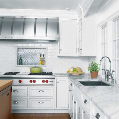
This is a Victoria Hagen kitchen. I loved the soapstone, subway tile and pendant lights. I also liked the beadboard ceiling, but perhaps a bit more scaled back.

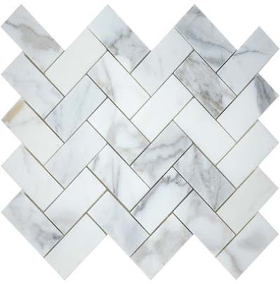
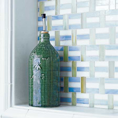
I loved this box out behind the stove for oils, peppermill, etc. I liked the different tiles with the white subway tile. But I preferred Calcutta marble in a herringbone pattern like this one below:

Here's my inspiration:
 Here is my box out behind my stove:
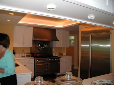
Here is the before looking into the kitchen: (that is me holding my nephew while my sister takes the photos)
We pulled out the small upper cabinets above the island and added pendant lights. We replaced the upper cabinets by the stove. Then we also pulled out four of the lower cabinets to create a center island. The new "island" has curved soapstone, which you can not see in this picture. Notice the beadboard in the recess of the ceiling and the pendant lights. Also look at the before picture and notice how the windows are lower than the doorways - this always annoyed me, but I was able to correct it during the process.
 Notice the plain ceilings in the before picture and the beadboard ceilings in the after. Also new sinks and faucets and moulding details. I also added ice box latches and bin pulls to the cabinets.
 Here is a great picture of the windows which have been raised up about 4 inches so the door and window moldings align.
Here is the TV area before:  And after:
As soon as my new furniture and chandelier arrive I will show you the lovely glass breakfast room with beadboard ceiling and adjacent family room area!
A little inspiration, finding the right quality cabinetmakers and lots of time helped bring my kitchen up to date and back to the original quality of the rest of the house. We are very happy with the result.

Beautiful! I'm looking forward to your next post. I don't remember how I came across your blog, but I love it! Thanks for sharing.
ReplyDeleteBethany
What an inspired makeover! Magnificent.
ReplyDeleteI can't wait to see more.
Love your new kitchen! Just gorgeous! Your fireplace addition is perfect. Curious, where is your beautiful butler's pantry in relation to your kitchen?
ReplyDeleteA couple of questions for you: on your Wolf do you have the griddle/and or charbroiler and are you happy with your choice?
Also, is your fireplace a Town & Country? Both elements we are incorporating into our kitchen design and would love your feedback. Thanks so much. joan
very nice job, good choices. Your kitchen is beautiful..Working toward redoing mine. It is a real challenge! Thanks for sharing.
ReplyDeleteWow. I particularly enjoy the clock art piece. It makes me smile while your renovation takes my breath away. Sometimes interiors are just so serious.
ReplyDeleteJoan:
ReplyDeleteThe Butler's Pantry is the room to the right of the stove - you can see it in some of the photos. My dining room is just beyond Butler's Pantry doorway.
My old stove had a grill which we never used because we grill just outside the door, so I chose the griddle. I love it! Great for pancakes, eggs and grilled cheese.
You have a great eye! The fireplace is Town and Country -I loved the clear glass and herringbone brick panels.
Hope that helps!
Simply breath-taking! Really magazine-worthy! You are SO very very lucky!!! :)
ReplyDeleteJan at Rosemary Cottage
You need to go into the reno business. Your ideas are wonderful!
ReplyDeleteGina- Thank you so much for your response, it helps tons! Yes, now I see your butler's pantry in the photos! Perfect location.
ReplyDeleteUp until about 4 days ago I was going with the infra-red grill, but then changed to the griddle; I am so very happy to hear you love it!
On the Town & Country it was the 'disappearing' glass that really sold us. We are using the herringbone too! I've only seen it in the showroom (we are adding one to our master bedroom also), so I am thrilled to see it in such a beautiful home. Thanks again for your valuable info! joan
omg - this is so gorgeous! I love that shelf and the ceilings and the soapstone !!! and the cabinets with the x's - it is so beautiful and it matches the pantry so well- perfection! job well done!!!! job excellently done!
ReplyDeleteThis is gorgeous... but, I'm still planning on stalking your butlers' pantry!
ReplyDeleteLove the beadboard ceiling - first thing I spotted!
What a fantastic makeover! It's really beautiful. I LOVE the very fun clock. I wanted honed soapstone in my kitchen but it wasn't an builder option. So that will have to be someday. In the meantime I have a blackish granite. It's close.
ReplyDeleteRight that's it Gina - I'm off down to the travel agent to buy you a ticket non-stop to Australia! As you know we are up to our necks in a total bathroom demolition & renovation, so while we continue on with that, you can just head off with my Mastercard & do my complete kitchen & Butler's Pantry fit-out - I trust you implicitly. Keep your eye out for the envelope with the red Flying Kangaroo on it. See you soon!
ReplyDeleteMillie ^_^
Millie - My bags are packed and ready to go - Not only would helping with your renovation be so much fun, I am sure the two of us would have a blast together! I fear we would just shop and gab the entire time!! Fun Fun Fun!! :)
ReplyDeletexx-Gina
I just found your blog and love your new kitchen and butler's pantry. So well done. Just gorgeous.
ReplyDeleteI am jealous as I am a historic preservationist and my husband and I are working on renovating our 1906 stone cottage... I cannot afford the total kitchen redo, so I am working on an "interim" solution by painting and sprucing it up.
We have similar tastes as my inspiration kitchens have period features like soapstone, apron-front sinks, beadboard, subway tile, and latches/bin pulls. In fact, I have been writing some FYI type historical info in my blogs on beadboard, subway tile, etc. Figured I would try to share some of the knowledge.
I am looking forward to seeing the rest of your gorgeous home!
You have been very busy! Your new kitchen is beautiful. I love the new color scheme - the gray is a great shade. I particularly love the wall of windows that let in so much light!
ReplyDeleteThank you so much for sharing! I love the new kitchen and its perfect with your office/butlers pantry. Makes me want to start designing our new home now!
ReplyDeleteWow you made some stunning changes! Love that little cutout above the range! Do you love your soapstone? Oil it often...or just once?
ReplyDeleteAnd it complememnts your pantry so beautifully.
Oh...and that clock is FANTASTIC!! I want to see a fire in your fireplace...can you see it from the kitchen?
Ok...enough questions!
Beautiful, beautiful, beautiful!
ReplyDeleteI love your attention to detail, Gina.
Getting rid of those upper cabinets was such a great idea. It really opened up the view (and who would want to hide those gorgeous pendants!).
Love the grey on the walls. Would you mind passing along the color? It really compliments your white cabinets and ceiling.
Can't wait to see the rest!
xo
Brooke
Linda-
ReplyDeleteThe soapstone is Santa Rita Venata. It has so lovely veining of green and creamy white. I used to oil my soapstone a lot, but it develops a patina and I hardly oil it now. Its no big deal -really easy - wipe on and off. I am always surprised people make such a big deal out of it. Its low maintenance.
You can not see the fireplace when standing at the stove, but when sitting at the center island you can see it. One photo shows it on -I rarely shut it off these days its been so cold here.
Brooke-
Thanks for the sweet comments. The wall color is BM 1559 -Arctic Shadows. The Pantry cabinets are BM 1558 Fieldstone. Because of all the light in the kitchen I needed to go darker on the walls, but the wall color reads exactly the same as the pantry cabinets. It is a wonderful neutral! The cabinets, ceilings and trim are BM White Dove.
Hope that helps.
This is absolutely beautiful. You must be so happy! First the divine butler's pantry, and now this -- I wouldn't be able to sleep in anticipation of having coffee and making my breakfast in that gorgeous environment. Lovely, lovely, lovely. I love how the box came out, and the marble shelf does make it all the more special!
ReplyDeleteI can't wait to see the next post.
xo Isa
Mnay of you have contacted me directly, so here are the details:
ReplyDeleteThe wall color is Arctic Shadows(BM #1559)It reads the same color as BM #1558 -Fieldstone which is the color of the pantry.
Cabinet, ceiling and trim color is BM White Dove.
Bin pulls are RH; Ice box latches are Cliffside, knobs were here when I moved in. All brushed stainless.
The Clemson pendants are from RH.
Subway tiles are Bianca Crackle glaze from Horus Art.
Backsplash box out is Ann Sacks Herringbone Calcutta honed-white sanded grout. Honed Calcutta Shelf and side tiles.
Soapstone is Santa Rita Venata from M. Texira in NJ.
Beadboard is real wood tongue and groove, not pressed.
Sink is Houzer, Faucets are KWC.
Stove is Wolf, DW is Miele, Fridge is SubZero.
Wood floor is white oak with special dark walnut stain and then dark walnut stain to match existing.
I think that covers it all!
Thanks you all for your thoughtful comments! :)
xxx-Gina
Oh, your kitchen looks beautiful! I don't know if I have left any comments before, but I tagged you to my bloglist, I hope you don't mind.
ReplyDeleteit looks awesome, great job!
ReplyDeleteWow, looks fantastic!!!
ReplyDeleteGina, Thanks for the list of sources. I'd like to ask one more. What is the material on the surround of the fireplace? Is that black granite? Thanks!
ReplyDeleteMichelle-
ReplyDeleteThe surround around the fireplace is Soapstone. We made it from left over pieces of the Santa Rita Venata slabs we used to do the kitchen counters. :)
You've turned an average looking kitchen into a stunning one! Congratulations on turning your vision into reality - you've done a beautiful job!
ReplyDeleteWhat a great job! Millwork makes a house!
ReplyDeleteThanks for visiting my blog, so I could get to yours; I'm off to check it out.
Michelle
Love your kitchen! Looks so light and happy.
ReplyDeleteI have a couple of questions--
How do you like having the sink in the peninsula? How long is the peninsula? And how do you like the raised overhang (bar or whatever it's called)?
If this works well for you, I'd like to adopt your plan.
Thanks for any advice.
Teryl,
ReplyDeleteGo to my profile page, send me your email and I would be happy to answer your questions!
-Gina
It looks beautiful! Love those pendants and the recessed beadboard ceiling and the cabinetry......every little detail is perfect, really. You did an amazing job!!
ReplyDeleteWow, it's absolutely stunning! You've done an amazing job with the design!
ReplyDeleteIt's a DREAM kitchen!!!! Love the soapstone & the backsplash!!! So perfect. Your tv & mantle area too!!! You did an amazing job. You must be in Heaven!!! enjoy!!
ReplyDeletexoxo
Gorgeous! Love the bead board ceiling and boxed out area behind stove. A couple new projects to show to hubby, since we are in the midst of kitchen remodel ourselves.
ReplyDeleteThanks for the inspiration!
Wow Gina, that kitchen is beautiful!
ReplyDeleteBeautiful!! What a great makeover It`s so fun seeing both before and after photos too. It turned out so beautiful.
ReplyDeleteWhat a beutiful home you have! Just love the kitchen. Anett
ReplyDeleteGorgeous!! What an awesome job- you can tell you really thought it threw! I just stumbled upon your blog from the "crazy chick's blog who loves butler pantries" and I'll definitely be back for more! You have a great style!
ReplyDeleteTotally great--saw this through Garden Web. Love, love love the
ReplyDeleteshelf behind the stove.
What lighting did you use on your ceiling?
What a beautiful kitchen! You did a wonderful job. -susan
ReplyDeleteGreat photos and ideas. Thanks for sharing the inspiration pics too. Beautiful kitchen.
ReplyDeleteLOVE YOUR KITCHEN!!! Thank you for sharing your ideas! I do have a question. What is the size of your niche above the range? Thank you! Tina
ReplyDeleteI LOVE THE GRAY WALLS. PLEASE share with us the color/brand that you used for the gray walls. I'm building and need to decide on paint in two weeks. Again, what a gorgeous design.
ReplyDeletePlease read above for all finishes etc., But here is the wall color info.
ReplyDeleteThe wall color is Arctic Shadows(BM #1559)It reads the same color as BM #1558 -Fieldstone which is the color of the pantry.
xx-Gina
Thanks for sharing your lovely kitchen. Did you use a cabinetmaker for your new cabinets? how about the existing ones that you kept? Where they custom or a cabinet line? I just finished my kitchen and we are sadly selling the house to downsize and may move into a home with Omega cabinets that are perfectly functional but which I dislike so I am trying to figure out how to work with them.
ReplyDeleteWhat a wonderful remodel. I love the ceiling with the beadboard and how you added the lights and took out the cabinets over the island.
ReplyDeleteYou have the right to unveiled your kitchen because it looks fabulous and awesome. Thank you for the admirable posting and congrats!
ReplyDeleteLOVE, LOVE IT! I have that same picture from House Beautiful with the beadboard ceiling in my "kitchen must haves". Where did you get your pendant lights? Do you mine me asking how much the whole reno was?
ReplyDeleteI can't stop reading your blogs and look forward to your next one...
ReplyDeleteGreat information, fabulous ideas, to die for pictures.
Thanks again for sharing!
I know your cabinets are BM white dove, what kind of paint is it? they look great
ReplyDeleteThey are painted with Ben Moore Satin Impervo in oil, not latex. The finish is smooth and very durable.
ReplyDeleteGina –
ReplyDeleteStunning!! We’re actually looking at the same Clemson pendants for our 3’ x 8’ island, but we’re stuck on what size to go with. Are yours the 14” or 18” diameter? And how long is your island? Thanks!! -Mac
ABSOLULETLY gorgeous now! So lovely, bright and welcoming but still has such a rich feel!
ReplyDeleteNice after.
ReplyDeletepve
I love your kitchen! May I ask what finish your KWC faucet is as well as the pendant lights from RH? It looks like you have both polished chrome (faucet) & nickel (light fixture) & that the finishes work well together in the photo. Thanks in advance.
ReplyDeleteLisa
Just found your blog! Love the kitchen! Its gorgeous!
ReplyDeleteLove your kithen!! It is is similar to the one I just remodeled in my home (but I like yours better). Now I am looking for a round dining table for my breakfast area - amy suggestions?
ReplyDeleteCongratulations again. What a beautiful work. It's amazing how a well thought and planned design make such a difference. You brought in so much light into the kitchen with your choices.
ReplyDeleteHi I love all of what you have and all of what you do. I noticed the clever looking grandfather clock you have and was wondering where, how or if I could get one. Wondering too, what you may have paid for that? I love it!!!!! I gotta have one of my own! Help!!
ReplyDeleteHi Gina,
ReplyDeleteI am so inspired by your kitchen! can you please share the source for the cabinetry?
Love Christopher Peacock kitchens too!
ReplyDeleteYou did a great job! Love your new header and your style.Thanks for sharing your great posts.
I am a follower!
Hi! Can you tell me what bar stools you used? It seems to be 2 different kinds....i think one is from Ballard Designs? The other 2 is exactly what I'm looking for b/c they have an extra foot rest higher up in front, for my little boys. Thanks so much for your time,
ReplyDeleteJessica
Gina- I've come over from your guest post on Brooke's blog...
ReplyDeleteThis kitchen remodel is just amazing. I can see why Brooke thinks you would never want to leave this room! So happy to find your beautiful blog...
Loretta
Your kitchen is STUNNING!!!
ReplyDeleteI really want to see photos of your kitchen. How do I find them? I am updating my kitchen now and am thinking about subway backsplash. Thanks.
ReplyDelete