One of the wonderful things about having a sister in Denmark is having her share with me some of her favorite shops. She was excited to see this shop featured in Skona Hem and sent it along to me.

K & CO is a wonderful antique shop in Copenhagen. The owner's home was recently profiled in the magazine. Their home is a wonderful mix of industrial and Gustavian styles. Let's have a peek.

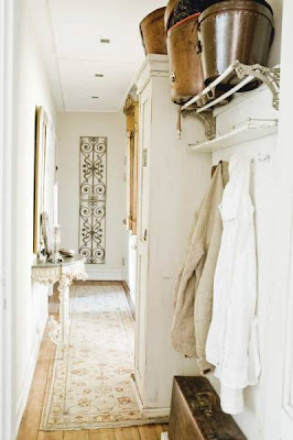
In the entryway a console table with marble top was given a new coat of Gustavian gray paint. The iron roof decoration is a beautiful focal point and the vintage shelf makes wonderful coat rack.

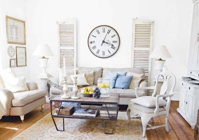
The living room is an interesting mix of hard industrial lines and soft linen upholstery. The antique pedestals, lamps and desk, add interest and soften the room. The vintage clock and antique shutters above the couch are charming.

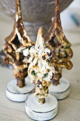
Through out the home the couple adds unique accessories that add whimsy, texture and personality to the space. Above are rusty steeple finials that once sat on a church roof.

The kitchen is a wonderful mix of stainless steel appliances, Ikea cabinets and hand worn antiques. I love the Danish hanging cupboard filled with traditional blue willow plates. Also the Tolix chairs add a wonderful feeling to this space. The owners enhanced the chandelier with antique crystals.

Part of an ancient altar screen hangs on the opposite wall of the kitchen.

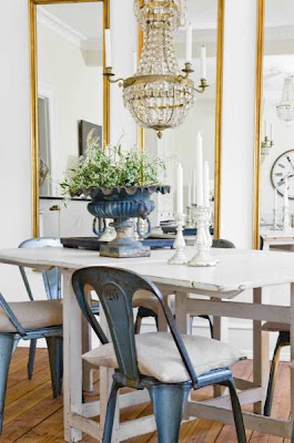
The dining area also has the Tolix chairs. I love the linen pillows as chair cushions. The chandelier gives the space a bit more formality and sparkle; and the mirrors bring your eye up and open up the room. Vintage candlesticks and fluted cast iron urn add a rustic contrast.

Finally the bedroom is serene in all white. The owners collection of vintage perfume bottles and female bust in Bronze become a uniquely personal vignette.
With such wonderful items available to them, they certainly have created a gorgeous home.
.
(all photos Skona Hem)
Very nice :-) I really like how they've combined old and new, rustic and sleek all together. The big clock over the sofa and the chandelier in the kitchen are my favourite pieces.
ReplyDeleteKelly
What a fabulous home! I especially love the mix of different styles. Hard to pick what I like the most, but I do love that whole island vignette in the kitchen.
ReplyDeletemarcie
Hello! I love the vintage/antique hat boxes (aka "buckets")on that top rack. And the crystal chandelier and gilt mirrors off setting the cooler Danish tones. Merci! Trish
ReplyDeleteWhat beautiful Pictures. I love that store! As a shop owner myself I would visit there. The vignettes are casually elegant, and livable. The ouside is very inviting too..I will visit your blog more often I'm glad I stopped by!
ReplyDeleteLove the pictures. The chandeliers and the mirrors are fantastic :-)
ReplyDeleteI am happy i discovered your blog.
David
Anything that involves Tolix chairs has my name all over it. Brava!
ReplyDeleteI so love your blog, Pictures and your ideas!
ReplyDeleteYou have been tagged by me and received the Honest Scrap Award!
Please stop by and link back! Love to read about you!
XX
Victoria
Beautiful pictures. I think the chandelier in the kitchen is my favorite.
ReplyDeleteLove it all! The chairs, the cabinets, the mix of industrial with antiques...the colors...gray and white! Great post!
ReplyDeleteTake care, Laura
So gorgeous....why am I so afraid of white paint in my own home?!?!?!?
ReplyDeleteUnusual combination of old and new...or better to say...farm style with pure straight modern style.
ReplyDeleteQuite unusual but as a whole I like it...maybe except of that huge clock in the living room...too much for me.
I'm pleased to find that you enjoy K&Co, they have been featured quite often in different magazines the last year here in Sweden and appear at larger antique fairs as well.
ReplyDeleteThey also have a web-shop, quite good actually with many nice pieces from France and Sweden......great guys!
Tolix is one of my favs, great bar-stools, I have them in my kitchen.
xx
Ingela
Beautiful...I was taken away! Thanks for that.
ReplyDeletei love the train rack (coat rack) and the mercury pendant .
ReplyDeletexx great look.
I love this post Gina- just incredible rooms! Our best friends are from Denmark and we're hoping to join them at their vacation home there next year so your post has really inspired me to book our trip!
ReplyDeleteHappy Monday to you.
I have read about this shop somewhere before. A wonderful combination of simplicity and elegance. Great post, as always.
ReplyDeleteIt's a rustic and elegant space that has a comfortable, lived-in quality. Nice! :-)
ReplyDeleteShannon
This is so cool to get images like this from your sister! So nice to see things we wouldn't get to see otherwise.
ReplyDeleteYou know I love the big clock and the shutters, because I have them in my living room too!!!
xo xo
Beautiful photos!!
ReplyDeleteHugs
Anette:)
What a treat to see this house! I love the iron architectural detail on the wall, and the beautiful crystal chandelier set among more rustic items.
ReplyDeleteinspiring post!
ReplyDeleteand lucky you to have a sister in denmark.
my fave was the architectural altar piece, what an unexpected piece in the kitchen.
would anyone from these regions have any design magazines they would recommend? the dearth of u.s. shelter magazines has me looking elsewhere
debra
A beautiful home with exquisite taste....I would love to visit their shop, I am sure it would be an enormous temptation. xv
ReplyDeletethese are marvelous interior design. i love it it's simple, elegant and sophiticated.
ReplyDeleteWow! I love the chandelier. It really caught my attention, very beautiful.
ReplyDeletebeautiful X 100!
ReplyDeleteGina,
ReplyDeletei just love seeing how our friends (and family) design outside of the US. Great decor transcends any distance! Fabulous rooms...
xx
fabulous post... and a wonderful blog... x pam
ReplyDeleteWell Gina...this is all so dreamy...reminds me of how much I love white! I was just distracted though by your butler's pantry..oh my God how on earth did I miss that!!! I would honestly be the happiest camper blogging away in such a divine place.
ReplyDeleteOk now I'm going back to read more of your posts, much catching up to do here.
Have a great weekend.
Lisa
I'm partial to a home filled with contrasting, visually appealing elements. This one is wonderful!!! Lucky you . . . you have a great place to visit. Nice post, great blog. I'd like to invite you to participate in my GiveAway contest. Check it out if you have time. Thanks for sharing, -susan
ReplyDeleteI love the kitchen and hallway! I'm have a small chandelier in the kitchen at Garvinweasel. Thanks for a lovely post.
ReplyDeleteI love danish style !! These shops look fantastic !!
ReplyDeleteBreathtaking images and just gorgeous design! I may have to move my family to Denmark!!!(I wish.) Thank you so much for sharing :)
ReplyDelete