 This lovely home in Greenwich, Connecticut was recently featured in CT Cottage and Gardens.
Located in the exclusive Sherwood Farms area of Greenwich this home was just listed for sale. Advertised as owned and decorated by an interior designer I was immediately intrigued. Let have a quick tour...

The beautiful front to back entry has 11 foot ceilings. I adore entrys that allow you to view straight out to the back of the house. I also love the light the comes in with this type of window/door placement. Notice the lovely bridal staircase and incredible moulding detail. Banister is ebony stained with white painted accents, a popular trend.
 Off to the left of the entry you can see the Library. Advertised as an antique English pine library with adjacent game room with wet bar; the detail is amazing. I am a stickler for symmetry so I really like the two doors on either side of the fireplace. The brown painted ceiling adds a coziness to the 11 foot ceilings. I also love the jazzy zebra chairs to lighten things up bit. Flat screen TV above the fireplace makes me think this is a real recreation area for the family. You can see an air hockey table through the french doors.
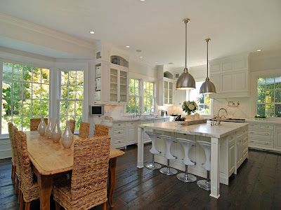
The kitchen has a definite Christopher Peacock feel. No real surprise as we are in Greenwich where a large number of his kitchens have been installed. The listing does not call it out as a Peacock kitchen but surely it has the look with the Carrera marble, white cabinets and bin pulls. I do like the contemporary stools which give this kitchen a bit of edginess. I also like the wide floor boards, the rattan chairs and the worn farm table. They add a nice, earthy texture and feeling to what could be a cold space.

Ice box latches and bin pulls make me think if its not Peacock, its a good copy. I also like the heft of the two inch marble counters.

The Family Room must be off the kitchen, but its hard to tell. It is a lovely area filled with light from at least two sides. The all white decor makes me think the children may be relegated to the library area. Bobo Intriguing Objects chandelier hangs above, which now can bought via Restoration Hardware.
 The Dining Room is beautiful. I love the off white/gray wall tones. Mirrored table and huge fireplace surely make for sparking, magical dinner parties. The Chandelier looks a bit small for the space. I would also like to see more artwork. Perhaps the owners have replaced the light fixtures, prior to listing the home.
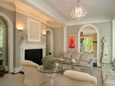
  The Living room continues the soothing gray palette. Notice the Mora clock on the right. I also like the garden urns on the acrylic tables. Its very unexpected.
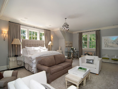
 The Master Bedroom also has a wonderful gray/taupe palette. I find it interesting that in such a large room they would locate the bed in front of the window alcove- but it does look lovely. We find some more acrylic chairs against the far right wall. The two chairs on the far left side of the photo confuse me though. From this angle the taupe one looks out of place. It is also interesting to note that is the first room we have seen drapes.
  Finally the Sunroom which opens to the fabulously long veranda/covered porch. The "SIN" sign speaks to me - and I like the furry pillows. Both add some more of the edginess we have seen in some of the other rooms. Again we see drapes, perhaps these are to shield the sun.
 Here is the a photo of the back of the house and the spectacular veranda.
The listing mentions:
the French doors lead to verandas from most public rooms with private views of conservation land. The second floor features a wonderful master suite with a Waterworks bathroom and walk-in closets. Five additional family bedrooms are on the second floor, and the partially finished lower level offers play space and an au pair suite.
It is really a lovely home and a fun tour for all of us!!
For more information on this house click here.
(all photos Sothebys)


i certainly loved this tour! what a beautiful home. thanks for sharing!
ReplyDeleteWhat a fun house tour! Love the kitchen and the bedroom. A little puzzled by the orange sofa on the back porch, though.
ReplyDeleteThe house has fabulous bones, space, light and is beautifully fitted - an absolute treat! The appointments bore me a little... maybe it's me.
ReplyDeleteThe color palette is divine! I love the gray living room especially.
ReplyDeleteWow Gina, that entryway is a show stopper. It's absolutely perfect.
ReplyDeletewow that is a truly beautiful home, I'm finding it hard to flaw it! so gorgeous - I would live here in a heartbeat!
ReplyDeleteyou know I had to have another look over it I loved it so much, and this time I read everything you said carefully..(I usually ignore most commentaries and just look at the pics!!) but I loved this place so much I had to see what you said about it - and like, I'm wondering why the bed in front of the window... maybe the other walls had heaps of windows too??? I truly love this home, and after all the homes I've seen (see my blog), I can say this with all confidence!
ReplyDeleteI would buy this house for the property, exterior facades, but most of all for the staircase!!! Thanks for such a lovely tour!
ReplyDeleteI really like some of the fun funky touches thrown into the traditional decor. Also, the rattan chairs in the white kitchen add just the right amount of texture.
ReplyDeleteLeslie
It is move in ready for me!
ReplyDeleteBeautiful! And what man wouldn't die to have that library?- mine would be in hog heaven. Thank you so much for sharing.
ReplyDeleteMe encanta esta casa. Pero como siempre, lo mejor es el Mora Clock!!!!
ReplyDeleteUn reportaje precioso. Gracias.
* Gina, you were so right!~~~ it really DOES look like a "real family" not only "resides" here, but truly LIVES here! Nice to see!
ReplyDeleteI just redid our bedroom in mostly more creams/variation of soft whites, etc., but w/ this home's bedroom colors as my accent colors, and both the hubs and I truuuuuly love it!!!.....
ANYHOOOOO, I sure hope I DON'T get "sent away" from "blogland" (w/ a "yukko" note pinned to my chest, no less!) banning my return, BUUUUT, I was a bit "stumped" about that bedroom. More than the bed placement (possibly, it COULD have been more important to THEM to have it be the first thing SEEN as you enter their suite, as compared to putting it on another wall??)...
ANYHOO, no matter HOW large a bedroom IS, to ME, tooo many chairs and/or seating places just doesn't "feel right"... I mean, bedrooms are usually for two (or one, plus beloved pets OF COURSE), and when I see two seats lined up against the wall, it kind of gives me a creepy feeling~~~ like someone is there watching us sleep or something of that nature!!!
I'd REALLY APPRECIATE KNOWING: is it just ME, or does anyone ELSE get that rather "uneasy feeling" about that?
EIther way, tho, it I*S such a wonderful home!!!
Thanks so much!
Linda in A *
bellesmom1234@comcast.net
* OOOOOPS!!! MAYBE I got it!!! This ISSSSS a wonderful & obviously well-loved & appreciated FAMILY home... maybe they have young ones (we were never blesssed with them) and they all gather in there at night or early morning for a few minutes, before starting the day, just for family time.... COULD THAT BE IT??? Thanks again! Best, Linda
ReplyDeleteWow! Simply breathtaking. I'm a new follower. ~Lisa
ReplyDeleteBeautiful home - thank you for sharing. I love the hardwood floors and would love to achieve a similar color on my 5" red oak floors. Could you suggest a color? Many thanks!
ReplyDeleteThis home is gorgeous from the outside in! The kitchen is my dream literally. I have my home plans of my kitchen laid out exactly like this with windows and all! Thanks for sharing.
ReplyDeleteDaisy~
I really like the pendant lights... do you know where I could find ones like that?
ReplyDeleteI think this just sold for under $5. I do believe the owner/designer is lisette coen.
ReplyDeletewonderful!
ReplyDeleteA beautiful and super charming home....love how its been decorated, its so inviting, warm and elegant. Only thing I thought was odd was all the extra seating in the bedroom....its not a waiting room! I have always thought its strange when you see a lot of seating in a bedroom, a few chairs is fine but more than that makes it look almost living room ish, and that orange sofa on the porch, not getting that but otherwise its a dreamy home....many beautiful rooms, just a great vibe!
ReplyDeleteThe staircase in this home looks quite similar to the one at Mount Vernon, George Washington's home. Is it patterned after it?
ReplyDelete