 (all photos by Eric Roth - used by permission)
I have always loved the Shingle style and Clapboard homes of New England and especially Cape Cod. So imagine my delight when Catalano Architects, whose firm has been has been widely published, including features in Metropolitan Home, The Boston Globe, Better Homes and Gardens, Custom Home and Down East Magazine; offered me a sneak peek into their one of their spectacular projects in Oyster Harbor, Cape Cod, Massachusetts. It is a large home but Catalano Architects kept this sprawling house from appearing huge by introducing a variety of roof lines and shapes. This gives the impression that the house has grown over the years, a piece at a time. They tend to design a home that is "traditional" without being specifically historical. Creating a house like this for their elite clientele usually takes close to 24 months from design to finish build. Let's have a look inside.
 It is a large home but Catalano Architects kept this sprawling house from appearing huge by introducing a variety of roof lines and shapes. This gives the impression that the house has grown over the years, a piece at a time. They tend to design a home that is "traditional" without being specifically historical. Creating a house like this for their elite clientele usually takes close to 24 months from design to finish build. Let's have a look inside.
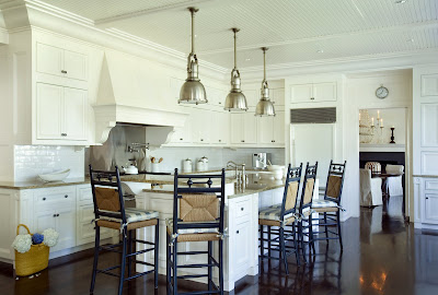
A wonderful classic white kitchen with subway tile and dark wood floors. This is a classic! I like the texture of the counter stools and lights look like Circa lighting. Notice how the crown molding of the cabinets goes right up to the beadboard ceiling and wraps around the space. 

A pretty breakfast nook! I love the built in banquette seating. Notice how the windows are a bit higher to accommodate not only the bench but also the cushion on top. Catalano makes sure that during the design phase the landscape architect and interior designer have a voice in the project. The results are obviously beautiful and very well planned. Right down the seat cushion! Sconces with checkered shades echo the checks on the seat cushions.

The color scheme in the family room is so soothing and classic New England Beach house! It highlights the water views from the expansive windows. Notice the architectural detail in the room - wainscoting, built in benches and ceiling mouldings all add a level of detail that adds a richness to this project. Sconces on either side of the bench and a hanging lantern are also nice touches.
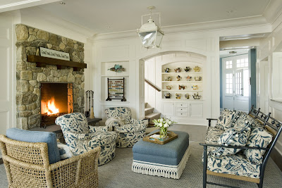
 Though the house is large the room scale is perfect. Here the sitting room feels cozy with the addition of a spectacular stone fireplace. Again notice the details: Built ins, wainscoting even a small niche for an antiques. Also notice how the designer adds textural interest in this room with the wicker chairs, bench, heavy fringed ottoman and carpet. Another lantern hangs above.
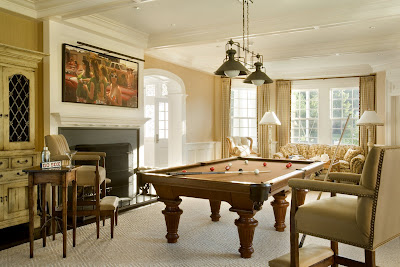
The house was obviously built for fun - here is a wonderful pool room. The departure from blues to tans and beiges give this room a more masculine feel. Notice the archway to the front hall - not only are the moldings wonderful but the depth of sides of the archway adds a feeling of heft and subtlety give the home a feeling of significance. 

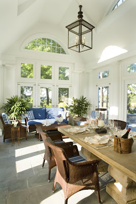
The upstairs entry hall is so pretty. The windows flood the space with incredible light. I also admire the railing detail. Again wood finish work detailing abounds. The sunroom is a wonderful space. Notice the hardware on the doors - a really fabulous touch. Of course the decor is beautiful and a wonderful transition to the outdoors. I love the pine garden table and wicker chairs. Notice the windows - here you see them from the inside.
 And now from the outside. I love the eyebrow window in the sunroom. I love the interest it adds inside the room, but also to the roof lines. Here you see the bluestone patio and infinity edge pool. This is also a wonderful example of how the landscape architect, being involved from the early phases was able to create such a beautiful area.
 Another photo of the pool from a different angle. I really love the softness of grass/stone pathway. Also notice the iron railings and the way the small annual beds create softness in what could be hard corners on opposite sides of the stairways.
 The sunroom is a wonderful space. Notice the hardware on the doors - a really fabulous touch. Of course the decor is beautiful and a wonderful transition to the outdoors. I love the pine garden table and wicker chairs. Notice the windows - here you see them from the inside.
 And now from the outside. I love the eyebrow window in the sunroom. I love the interest it adds inside the room, but also to the roof lines. Here you see the bluestone patio and infinity edge pool. This is also a wonderful example of how the landscape architect, being involved from the early phases was able to create such a beautiful area.
 Another photo of the pool from a different angle. I really love the softness of grass/stone pathway. Also notice the iron railings and the way the small annual beds create softness in what could be hard corners on opposite sides of the stairways.
.
The work of Catalano Architects has been recognized and has won several design awards from Metropolitan Home and The Boston Globe. Metropolitan Home magazine observed, "Architecture doesn't get any better - or more satisfying - than this."
.
Still want to see more? Pick up Better Homes and Gardens Beautiful Homes Summer 2009 issue to see more of their work featured on the cover and inside! I also encourage you to visit Catalano Architects website to see more of their beautiful projects.
Many thanks to Thomas Catalano and his staff for sharing this wonderful project.

This is a gorgeous house - thank you for the tour. xv
ReplyDeletewow amazing!
ReplyDeleteWhat a treat you have shared with us. A few things that caught my eye: the painting at the top of the stairs, the lantern in the sunroom, and the infinity pool.
ReplyDeleteWhat an amazing home. It is classic, pretty traditional, and still so fresh and current! Love it. Thanks for a great post!
ReplyDeletei love the blue living room with the lantern - gorgeous house, just fab.
ReplyDeleteOoooo...I'm in LOVE! Look at all that LIGHT! Love it!
ReplyDeleteWhat a beautiful house, I especially love the sun room and the kitchen.
ReplyDelete* Such classic, soothing n' beautiful color choices were made for this comfy n' wonderful home~~~ Thanks for sharing it with us!
ReplyDeleteBest,
Linda in AZ *
It is all so gorgeous, but I especially love the upstairs hallway with the blue walls and all the gorgeous woodwork. That railing is incredible. I'd love to sit in that sunroom with a good book! Thanks for sharing!
ReplyDeleteI think this is it. You've found my dream home. So many times, I look at homes and like one room or another, but I love EVERY room--including the pool. Just dreamy!
ReplyDeleteBeautiful home! My favorite room is the sunroom. I had never heard the term 'eyebrow window', although that makes perfect sense!
ReplyDeleteKarenB, you and I have the same thought. I'm nuts for that upstairs hallways. I wonder what color blue that is.
ReplyDeleteHi!
ReplyDeleteWow! I looove your blog!! The photos are gorgeous!!!
Anette from Norway:)
Beautiful tour. I've seen the exterior shots of this house before ... never the interior. Beautiful, just magnificent. Great blog!
ReplyDeletewow wee
ReplyDeletethe pool is a stunner.
*and the rest of the place.
this is making me miss maine.
xx
Eric Roth takes such fabulous photographs.
ReplyDeleteThe blue living room is fabulous, the ottoman really a charming focal point. Not the biggest fan of country blue plaids but otherwise the place is lovely.
ReplyDeleteHow incredibly lovely. The millwork is wonderful and the palette so pleasing. I especially love the banister, newel post and railings on the second floor. So evocative of history, yet very modern as well.
ReplyDeleteThat kitchen, and your other postings about *subway tile* requires me to ask: who makes the best subway tile for the gorgeous subway tile backsplashes seen throughout the Willow Decor kitchen photos?
ReplyDeleteYOUR own home especially! Thanks for any 411.
Shannon,
ReplyDeleteI used Horus Art Crackle in Bianca. It is machine made which I chose because I wanted very thin grout lines. Handmade tiles are imperfect and as such, the grout lines tend be larger.
The Calcutta Marble Herringbone is from Ann Sacks and the marble shelf was custom.Hope that helps.
xx-Gina