Showing posts with label My House. Show all posts

Monday, October 24, 2011

Re-working My Home– From Conservatory to Library

Library20to20Sunroom_thumb1

You have all followed the décor of my Conservatory.

Conservatory-0_thumb1

My wonderful framed intaglios, (Dave hanging them just right), my crystal and mercury glass holiday decorations, landscaping the gardens beyond. But, what you may not know, is how little this room has been used over the past year.

Conservatory-2_thumb7

You see I believe this is one of the most beautiful rooms in my home. I used to love to sit with my children and listen to them practice scales and new songs. But alas, homework, sports and friends have distracted them and sadly I am giving up every Mother’s fight “You need to practice your piano!” – They have moved on to other things and finally so must I.

Conservatory-3_thumb1

So what to do with this room? My husband has always wished for a library. A wonderful wood paneled space to work, read and relax. So we have decided to say goodbye to the piano and hello to a new library.

C-Brinkley-Tower-hill-Great-Room-3_t

Here are some of my inspiration photos. This is Christie Brinkley’s Great Room of her Tower Hill home. Not quite a library but I have always loved the light wood and the detailing on her crown molding. The room is beautiful, and with windows on two sides the light is similar to my Conservatory.

Library20to20Sunroom_thumb6

This has been in my files for a long time. I found this wonderful room on MLS. I adore the wood ceiling, leaded glass bookcases and glass arched door.

library-Ms-howard.jpg-2_thumb1

This room, from Mrs. Howard, really shows the type of wood I want. I love the paneling, although this room has much higher ceilings and is much more grand than my smaller space.

library-Ms-howard_thumb1

These light tones are perfect, but I do not like so many knots in the wood. This room also from Mrs. Howard.

David-Easton-Veranda-2_thumb22

I am sure you remember my adoration of David Easton’s library in Aspen. This light wood is limed and then washed with grey antiquing glaze. This is interesting as my painted doors will need to be stripped and a glaze may make the new wood and the old wood much easier to match.

Conservatory-1_thumb20

If you look closely you will notice I only have one wall for bookcases to the right. It is also very narrow from wall to door molding. The Conservatory is very open to the Living Room right now, so I will need to add some doors. I want to keep the light coming in and do not want to lose too much space with swinging doors. I love pocket doors but I am afraid it will close off the room too much. However, it would give me another area for more bookcases. Hmm – lots of choices to make.

Doors-for-Living-room_thumb8

These glass does are similar to what I want. They slide over themselves so I won’t lose any space, but I prefer them to have glass to the floor.

2517ODonnell118_thumb

I like the arch over the bar in this library. It mimics the arches of my French doors. I wonder if my wall with the intaglios should have an bookcase with and arch.

library_thumb8

Here is a wonderful arched window in a library just being built down the street from me. The bookcase is straight, even though the main window has an arch.

libraryback-wall_thumb

I love the niche in this library for the couch. If I create a niche I think I would place Dave’s desk in front of it but should the niche be arched? I think this niche would have looked great with an arch.

library-Farifax-and-Sammons_thumb2

This Library from Fairfax and Sammons is a bit closer to what I was thinking, but the arch is much too deep for my space. It would definitely need to be scaled back.

I am hoping to have the sketches done by the end of November, but as you can see we are still in the design phase, so let me know your thoughts! Light wood or darker wood? Stained or Glazed? Glass sliding doors or closing in the room a bit with pocket doors? Arched bookcase or straight? This is turning into such a fun project! Excited to hear your thoughts!

Wednesday, September 14, 2011

My New Kitchen Slipcovers!!!

DSC_0467_2 (2)

Back to school and back to projects that needed to get to done! I am so excited to share with you my new kitchen slipcovers!

Let’s start at the beginning, with two teenagers, a big, hairy dog and an Italian family who loves Marinara sauce; my kitchen was not a perfect environment for my linen, upholstered chairs! We’ve been living with dish towels draped over the seats to catch any spills– not very pretty. I needed some washable slipcovers and I needed them pronto!
coco slips

As always I had an inspiration photo to show my wonderful seamstress (Photo: Things That Inspire). These were close to what I envisioned. I liked the straight lines and the overall length. I wanted something to cover the chair but not be too fussy.

DSC_0473_2 (2)

I also needed the slips to be washable. I found these wonderful oversized napkins from French Laundry Home. I like their “grainsack” look and feel. They were big enough to cover just the seat, so we needed something extra for the skirting piece.

familyroom

You might remember my wonderful linen blend curtains I found on sale last year at Country Curtains.

Family room

I bought extra fabric for $6 a yard and had these wonderful slipcovers made for my club chairs. Read all about my Family Room redo HERE. Fortunately I had enough fabric left to use for the skirting.

chair

Here is the chair before…(not pasta friendly!)

DSC_0467_2 (2)

And here is the slipcover after! Large enough to handle any spill and simple to throw in the wash!!

DSC_0469_2 (2)

I love the back – I didn’t want any ties.

DSC_0471_2 (2)

The hidden Velcro does the trick of keeping it neat and in place.

bench

The bench also needed a bit of covering up. As much as I loved the Antique printed grainsack I bought from Kym Fraser of 3 Fine Grains, it was much too valuable to be stained with hot fudge!

DSC_0475_2


A quick call to my dear friend, Wendy Lewis of Textile Trunk, and a more reasonably priced antique grainsack was on its way. We took out the stitching on both sides, sewed in the corners and added the ties. Look closely and you can see the fold (that was the bottom of the sack) still in the cover.


DSC_0474_2 (2)

An indestructible and beautiful slipcover!! You can also see the chairs with their new, pretty dresses peeking through!

breakfast room


The lighting was not the best when I took the picture this afternoon, but I wanted to show you how wonderful the new slips look in the Breakfast Room!

Sometimes it seems daunting to live with linen or all white furniture. Slipcovers are the secret! Your kids can eat hot fudge and still live in a beautiful room without worry.

Do click HERE to see the wonderful new stock of antique fabrics available from Wendy at Textile Trunk. She just got back from Europe and you will go crazy!! And get ready to see some kitchens I have been working on, some reader’s renovations I am thrilled to share and some more personal and professional projects I am starting for the Fall!!

So happy to be back!!

(all photos and content copyrighted by Willow Décor and not to be copied with out written permission)

Sunday, October 31, 2010

My Toy Room to Teen Room Transformation!

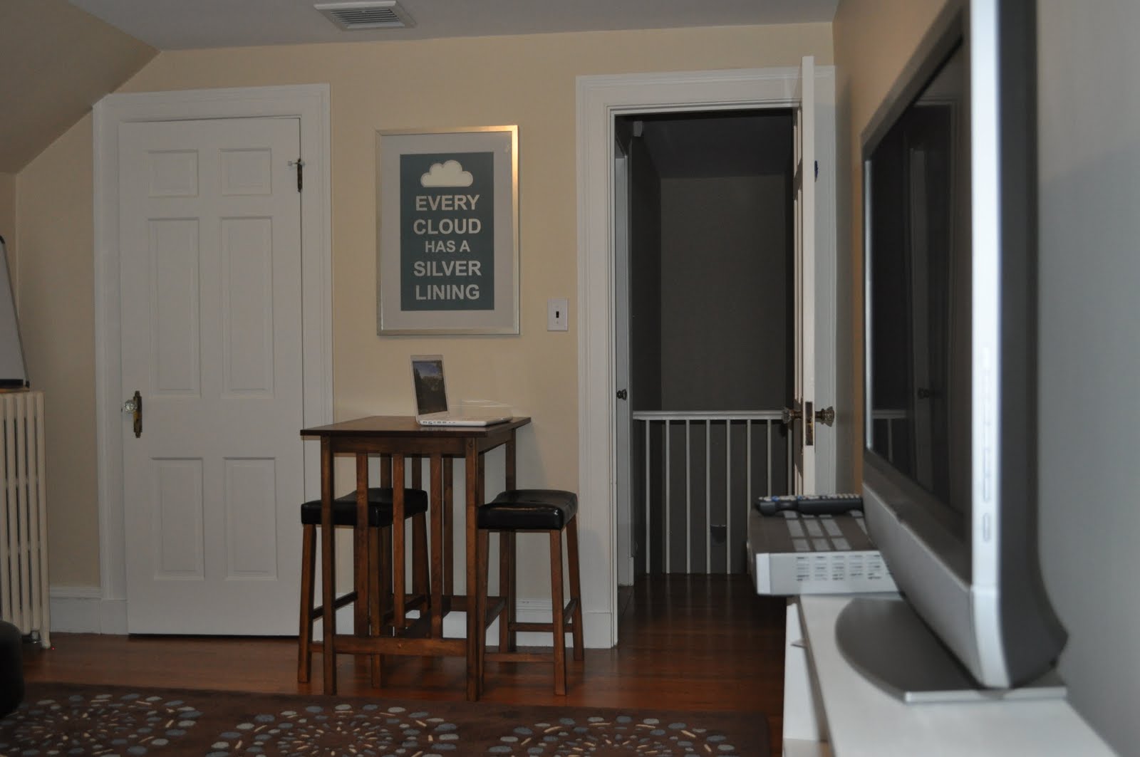
My children are entering the teen years now. As they grow and change the needs of our home have changed as well. One of the bedrooms over our garage had been a "toy room", filled with plastic Little Tikes Kitchens, Legos and Trains- a place for forts and building castles. My teenage daughter suggested that we re-decorate the "Toy Room" to be more Teen Friendly. I agreed and so (sadly for Mom) we have said to goodbye to Pokemon and American Girl Dolls.
Here is the room Before (actually we have two identical rooms above our garage, they are mirror images of each other and this photo is of other side). Like all decorating projects we had Goals, Restrictions and a Budget. The Goal was a room for for sleepovers, a place to do school projects where they could spread things out (and not be near their parents), and a place to hangout with friends and watch Movies and I-Chat! Our main Restriction was the doorway size. It is only 27 inches wide. And our Budget was $2500.
Here is the room after we ripped up the old carpet. Then we painted the trim BM White Dove and the walls BM Lighthouse Landing. Paint cost $4o. Paint, as always is an immediate improvement!
The kids were allowed to choose everything in the room and I treated them like clients on our shopping trip. We found this great, thick wool rug at HomeGoods for $600. (did I mention how much I love HomeGoods for rugs??) The kids liked the Pottery Barn feel and the blue and brown color scheme. While we were there the kids scouted some great pillows that matched and two small microfiber ottomans. All together we spent $800.
Meanwhile at home, my sister, who LOVES to organize, came over and sorted through all our arts and crafts supplies and organized everything in the old bins which used to hold plastic food and Matchbox cars. Now it is a perfect go to space for all the supplies we need for projects at school.
Thank you, Sandra! Cost - priceless!
We couldn't let go of the blocks, (well I couldn't) so they stayed put and we moved an old bookcase into the walk in closet for extra storage for paper and other supplies.
Dramatic drum roll.... Here is the Before.
And the After! We found this thin couch at Macy's and once we took the feet off it fit through our tiny doorway! The sectional microfiber couch was $1400 and the bar table and leather stools $199. at Overstock.com.
Inspirational artwork was $50 on clearance! Bookcase, side table, and TV we already had!
The total Teen Hangout Room Makeover cost was.....$2489!!
We still had money left over for a Movie and some snacks!! We found some wonderful bargains, stayed with in our budget and came out with a great room! The kids are thrilled and call it their "Hang Out Room" - I call it a success!!
'
Also a heartfelt thank you to the many, many kind readers who sent me get well wishes and prayers. I am truly blessed to have so many friends in blogland. I was beyond touched! xoxo
(all photos Willow Decor and not to be copied without permission)

Monday, March 29, 2010

Which Would You Choose???

Here are my current wood counter stools with the Ballard Design toffee checked chair cushions. If you look closely you will see that the chairs are actually different. The two on the ends I bought at a discount many years ago because they were being discontinued by the manufacturer. When I needed an additional stool I bought a similar one from Ballard Designs.
What I like - the tall backs, the warm wood tones and cushions - over all the chairs are very comfortable for sitting. We don't like that we can only fit three stools. I have two children and when they each have a friend over, only three can sit. Also we don't' like how the stools protrude into the walking area.
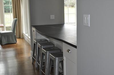
Here are the Tabouret stools. Aren't they great?! Did I mention they were only $50 each - I am still giddy about this...you can find them here. What I like: Aesthetically I like their lines and the way their color ties in with the stainless steel in the kitchen. I love how four stools (and children) fit. I also like how they push in and make a clear pathway for walking by. I don't like how cold they are to sit on in the morning and how uncomfortable they are with out a back. I also worry they are just too industrial looking (a family lives here after all!)
.
So readers, what do you think?? Which do you prefer and why???

Thursday, February 25, 2010

Antique China

Today is the 79th Tablescape Thursdays over at Between Naps on the Porch, so I thought I would share with a you a recent gathering I had where I used my antique Johnson Brothers green china.

You might remember that one of my goals of my Butler's Pantry renovation was to build some beautiful glass front cabinets to house these precious antiques. You can read all about the Butler's Pantry here.
But what good is China if you are only going to look at it behind glass? I decided to set it out for everyone to enjoy. You can see the antique soup tureen above.
I used Lemon Cypress trees as the centerpiece and pulled out my Apilco chocolate cups for individual arrangements at each place setting. I just put in a spring of greens and some berries.
You can see the bone dishes on the right - we used these as interesting bread plates.
And the covered dish held butter pats I made in pretty butter molds. I should have taken a photo of those!
I'll reveal the rest of the Dining Room on Monday but until then remember to enjoy your china and don't just keep it hidden behind glass.

Head on over to Tablescape Thursday to see more wonderful tables!!

Wednesday, February 24, 2010

About the Italian Chandelier!

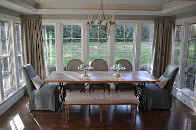
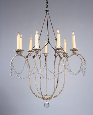
Many of you have emailed me asking more information about my chandelier. My interior photography is ever evolving (aka. not very good) and many of you wanted better photos. I was unable to get them because of the light. If you click on my photo above it should enlarge and give you more detail. But, if that does not work for you, I did have a few professional shots of the chandelier in my inspiration files.
The chandelier is made by Niermann Weeks. It is called the Italian Chandelier and comes in both 9 arm and 12 arm sizes. The photo above shows what is considered the standard finish - a distressed, chippy white. My chandelier was custom finished in an antiqued silver - it has a beautiful depth of color. Niermann Weeks has many many different finishes to choose from.
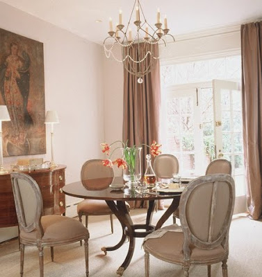
This photo from Things that Inspire via Anne Hepner gives you a very good shot of the piece. This example shows the fixture with shades, which I opted not to do. Here you see how nicely it looks in an informal room. This photo from Things that Inspire via Caldwell Beebe gives you a clear picture of the crystals that surround the fixture. I like the sparkle the singular strand brings to the room. It add a interest but its not too fussy. This room is also lovely, though a bit more formal than my breakfast room, but notice the similarities in the chair style and curtain selection.
I am sure you recognize this room from Better Homes and Gardens, which has been all over the blogs. Here you can see an example of the 12 arm style.
Niermann Weeks writes about the Italian Chandelier on their website.
They first found antique sconces, which led to the design of the chandeliers. They mentioned that English designer Nina Campbell hangs the Italian chandelier in her own bedroom, and every time she’s moved, it’s moved with her. The photo above is not Nina Campbell's bedroom, but another gorgeous room from the talented Catalano Architects.
'
Holly at Things that Inspire did a wonderful, comprehensive post on the Joe Niermann and the Niermann Weeks company. To read more about it click Here
'
The Niermann Weeks Company also writes an interesting article about how the design of the Italian Chandelier came about. To read more click Here.

To read more about my Breakfast Room click Here. Let me know if you have any other questions!