Monday, June 29, 2009

Ghost Chair Metamorphosis

Kartell

The Phillipe Starck Louis Ghost Chair is really beautiful.
We are seeing it everywhere.

flikr
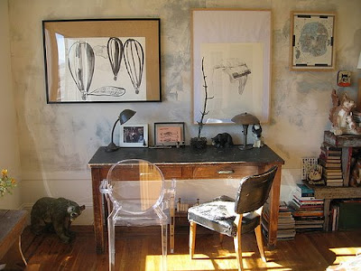
Here it is used in the most common way as an accent chair - totally unadorned. Lovely, but because it is getting so popular, not as unexpected in a room as it used to be.

Casa Sugar

Perhaps in an effort to reinvent it, the set designers for Gossip Girls had pads made for the chairs. I really do not like it, I think the chair loses some of its ethereal quality.

c.everad
But this recent make over stopped me in my tracks. I was taken by the incredibly classic form of the chair floating under the gauzy sheer slipcovers. Isn't this combination fantastic?


I would use this slipcovered chair in any number of rooms! What do you think?


Check out other makeovers on Monday Metamorphosis at Between Naps on the Porch

Saturday, June 27, 2009

In Atlanta!

Things that Inspire

We are spending a few days in Atlanta visiting family. Unfortunately I won't be able to meet up with my friend from Things that Inspire, because our schedules are too crazy. But while I am away you should visit the Atlanta Symphony Showhouse. Things that Inspire did a wonderful write up of this beautiful property. Here is the link - I hope you enjoy it as much as I did!!
See you in a few days!

Thursday, June 25, 2009

Finding a Niche for a Home Office

Apartment Therapy
I am always so impressed the way designers and architects find small niches for home offices. In my own home , we have a dedicated office space, but my husband often works from home and so it is "his"office. That left me trying to carve out a niche for myself in some other area of the house.
Here are some of my favorite ideas for fitting in an office when space is tight.
Brian Vanden Brink
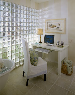
A quaint space, but look closer and you will see this office is in the bathroom. Not sure how the moisture will effect the computer, but in homes with large baths this is a creative alternative.

Hutker Architects
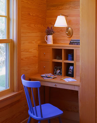
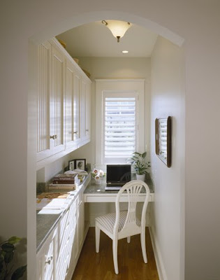
Have a small area in your hallway? Here is wonderful little space that has been efficiently utilized.

Domenic Mercadante
Here is an office created in the far part of a butler's pantry. Spaces doing double duty!

Willow Decor
Here is where I ended up! I carved out a niche office for myself when I created my Butler's Pantry. It does double duty as a functional pantry, housing appliances, serving pieces and dishes, as well as cabinets to hold internet wiring, printer and family files. Read all about it here.
Apartment Therapy
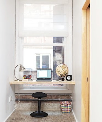
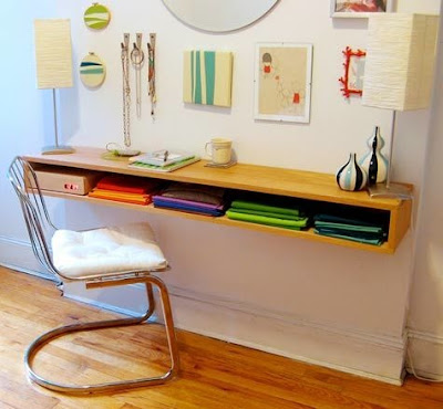
Is this a closet with a window, an entry or landing? This is one of my all time favorites. I love the the shelf desk and the wonderful natural light.
Centerbrook Architects
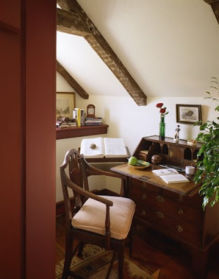
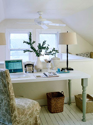
An attic alcove has just enough space for a small desk and chair.
Anthony DiGregario Architects
Here is an unusual space at the top of a landing. The owner added built ins for a very efficient space -notice how they wrap around to the right.
. Tittman Architects
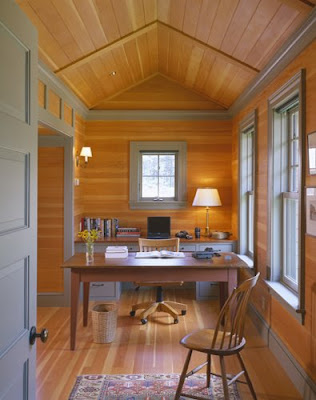
This area is not quite as small as some of the others but I included it because it is a space used by two people or one that does double duty. Notice the desk behind the table. Perhaps a shared space or the table is used for crafting.


Better Homes and Gardens
Another small area at the top of a landing or part of a small bonus/loft room.


Country Living
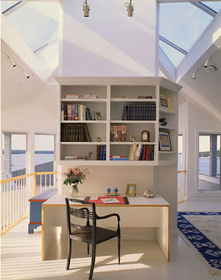
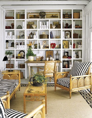
Although this office area is not in a small room; it is in a small space. Interestingly the desk is tucked into the bookcase design, taking very little space up in the room. Very creative!


Restyled Home
Here is a desk area tucked into a pass thru hallway. I like the vertical use of space in this area. The two chairs are also very functional for a parent to sit and help with homework.


This Old House
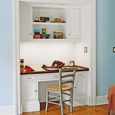
Of course a well designed closet space can be turned into a wonderful office. Take off the doors and viola - home office!


Steve & Chris
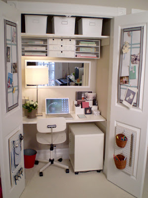
Or leave the doors on and close them if things get too messy. I really like the bulletin and peg boards on the doors for storage and notes.

Apartment Therapy
This is a wonderful modern example of how any space can be turned into an office.


Let me know how you have used an unusual area in your home as an office!

Sunday, June 21, 2009

A Perfect Match

(All photos Dallas News unless otherwise noted)
The team of interior designer, Shannon Bowers and long time friend and homeowner, Stacy Hyde was a match in made in heaven. Talented friends working together to create light filled renovation of a 1920's Mediterranean Revival home in Dallas.
The home in the Greenway Parks section of Dallas was originally constructed in 1920 with steel beams from a bank down the street that was being torn down.
The foyer is warm and inviting with it's hand stenciled floors and Swedish and French antiques. Notice the lovely iron work on the staircase which was original to the house. The Bergere chair is lovely covered in linen and the basket adds a unique juxtaposition with the entry table.
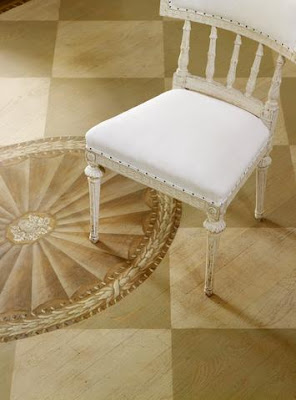
The stenciling on the floor was done very lightly so you can still see the wood grain through the stain. The detail is magnificent. The sunroom's linen covered Swedish settee and antique column table make a lovely vignette.
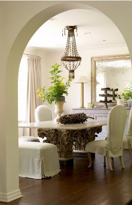
The formal dining room also has an interesting table. The antique column capitals were refitted with new bases to make the table the correct height for dining. A limestone top was custom made and the floor reinforced to support this one of a kind piece. Antique mirror and chest enhance the look. Notice how soft the room still feels even with the lack of a carpet.
The living room's slip covered linen settee sets the mood for this room. The Swedish table, antique chest and pale aqua urns add texture and color.
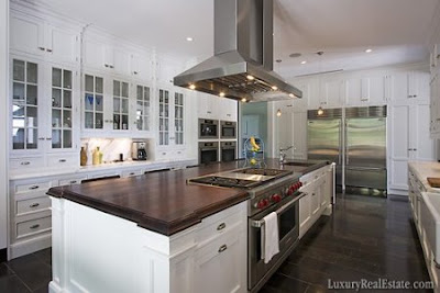
In the kitchen hang vintage industrial pendant lights which were re-wired for home use. The Lucite stools are slipcovered to add softness. White cabinets, marble and stainless steel add to the classic look.
A dark wine room was renovated into a light, airy butler's pantry. After a long search, the perfect wine racks were located at West Elm.
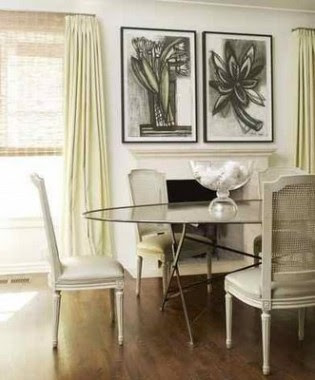
Charcoal drawings add a punch to the breakfast room. I love the zinc table and with the white washed chairs.
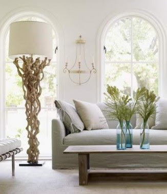
A den filled with texture including linen slipcovers and twisted grapevine floor lamp.
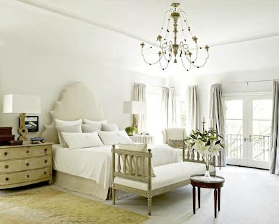
The master bedroom headboard was custom designed by Bowers in a crisp linen. Swedish bench and chest are illuminated by antiqued turned wood chandelier.
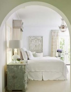
Hyde's daughter's room is painted a pale lilac. White linens and custom canopy make it a room fit for a princess.

Material Girls
Through out the redecorating process Hyde found herself traveling outside of Dallas to find the look she was after. This inspired her to open her wonderful home and garden store, Stacy Hyde, on Henderson Avenue. If you are in Dallas plan to visit, as her store inventory mirrors her home style.


To see more photos of Hyde's beautiful home here. And to learn more about the Stacy Hyde shop click here.

Tell me what you think about this renovation and and its interiors.

Please stop by Metamorphosis Monday at Between Naps on the Porch!
Monday, June 15, 2009

Hardware in the Christopher Peacock Style Kitchen

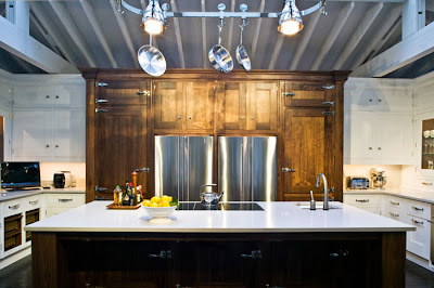
The Christopher Peacock Style Kitchen continues to be ever popular. For the elite few who can afford these kitchens they embody a classic, old world style. Popular among the rich and famous, Christopher Peacock has clients world wide and many in NYC and the Hampton's.

For the rest of America copying these kitchens seems to be a popular topic among many kitchen designers, clients and blogs. I have posted twice on Christopher Peacock. The first Elements of Christopher Peacock Style Kitchen remains my most viewed post. The second, Lighting in a Christopher Peacock Style Kitchen, is also very often frequented.
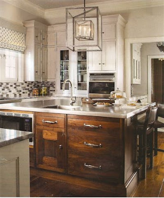
Recently I received a request to find this lighting fixture above in the most recently designed CP Kitchen. The result proved the power of the Internet when Velvet and Linen and Kitchen and Residential Design were able to work together via Willow Decor to locate it!
I get emails weekly from my readers for help locating similar style hardware. After months and months of research, and the help of my readers who also have undergone relentless searches, here are my best suggestions for recreating this look in your kitchen.
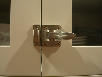
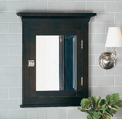
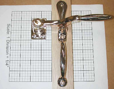
The Peacock Cabinet Latches: There are are two types of latches,
the "ice-box cupboard latch" and what I call "solid cupboard latch".
The ice box cupboard latches above, that are almost an exact duplicate, are from Cliffside Industries. They are very high quality and well made. I have these in my own kitchen and I love them.
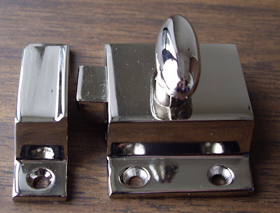
The CP solid cupboard latch is more common and available from many retailers including Restoration Hardware and several on line dealers.
Resotration Hardware
My readers have commented and I have read lengthy discussions on the range of quality of this design. Some are difficult to twist and, as such, become cumbersome for active kitchen use. Two manufacturers who consistently have rave reviews are Rejuvenation Hardware and Cliffside Industries. These products are very high quality, and are easy to manipulate. Other readers have mentioned that they order several extra latches from Restoration Hardware and return the ones that are hard to open.
Cliffside Industries
The Ice box latches on the Christopher Peacock Refrigerator panels and wall units proved harder to recreate.
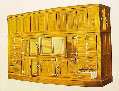
Eventually we found the Roseland Ice Box Company. They make a series called the McCray which are reproductions of the 1900's Ice boxe latches. The quality and look were exactly what were needed. I have never dealt with them directly but some commentors have had some issues.

Roseland Iceboxes
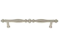
The range of pulls available are staggering. They can be found in several sizes from smaller cabinet to larger door pulls.
We have found that Van Dyke's, Merit Metal, Rejuvenation and Restoration Hardware had the best selections to emulate this look. I love the RH Aubrey and Bistro Pulls. I personally put the RH Bistro Pulls in my pantry. Other readers have had luck with Kennedy and Natz. This is an area where you can add a bit of your own personal taste to your project.


Rejuvenation
Van Dyke's
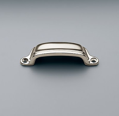
Locating the CP-like Bin Pulls were much easier, though personally time consuming.


In my own kitchen quest I bought 8 different bin pull look alikes. I mounted them on a board and had my family try each one to get an idea of how they would feel in day to day use. Hands down for quality and ease of use, as well as great design, I recommend the Bin pull from Restoration Hardware.


Last September Christopher Peacock Cabinetry was purchased for over 12 million dollars by Smallbone, a British company who has their own high end cabinetry line as well an umbrella company for several other lines, including Paris Ceramics. Smallbone recently filed for bankruptcy and its rumored that Christopher Peacock, himself, is trying to buy it back. It has even been rumored that he has tried to re hire his craftsman to avoid having them lose their jobs.
Sotheby's

We can only hope that Mr. Peacock is able to help keep the cabinetry business alive. Otherwise, we will need to find someone new to turn to for inspiration. All the links highlighted bring you to the exact product mentioned under each heading. I hope this helps my many readers who continue to use the Christoper Peacock Style as a source of inspiration for creating their own beautiful interiors. If anyone else has a good source do let me know so I can share it.

All photos Christopher Peacock Designs unless otherwise noted